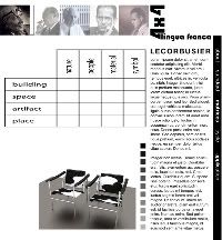
Spent last night sketching and working in Illustrator to create mockups of what my Modernism website could look like. Below are two representations, one of the homepage and one of a matrix page. There is a slight difference in the sidebar length between the two. The little gray-scaled squares on the matrix page would be roll-overs, different photos would pop up based on which square you roll over. I'm definitely not saying grayscale is my color scheme here, I'm just using it as a vehicle to get my ideas across. It's rather bland in just black/white. Also, I want to round the corner of the sidebar.
Yes/no?
Though, looking at it now I have more critiques of it than ever. I don't want people to have to scroll, so maybe I move the text to a roll-over like at the Gothic website. I don't want to clog up the page too much.
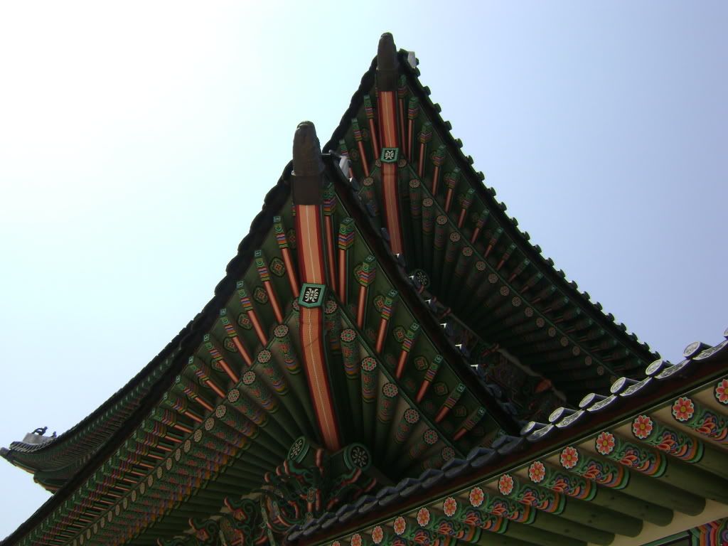
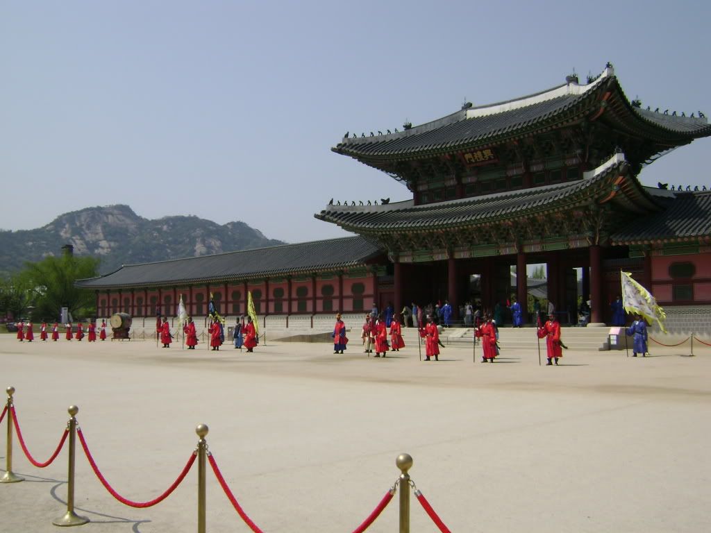
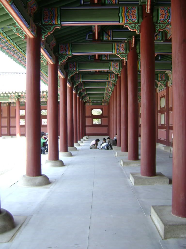
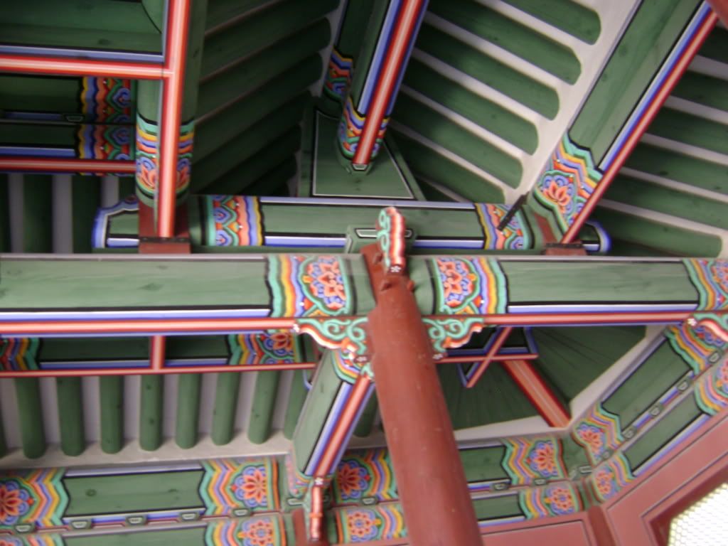
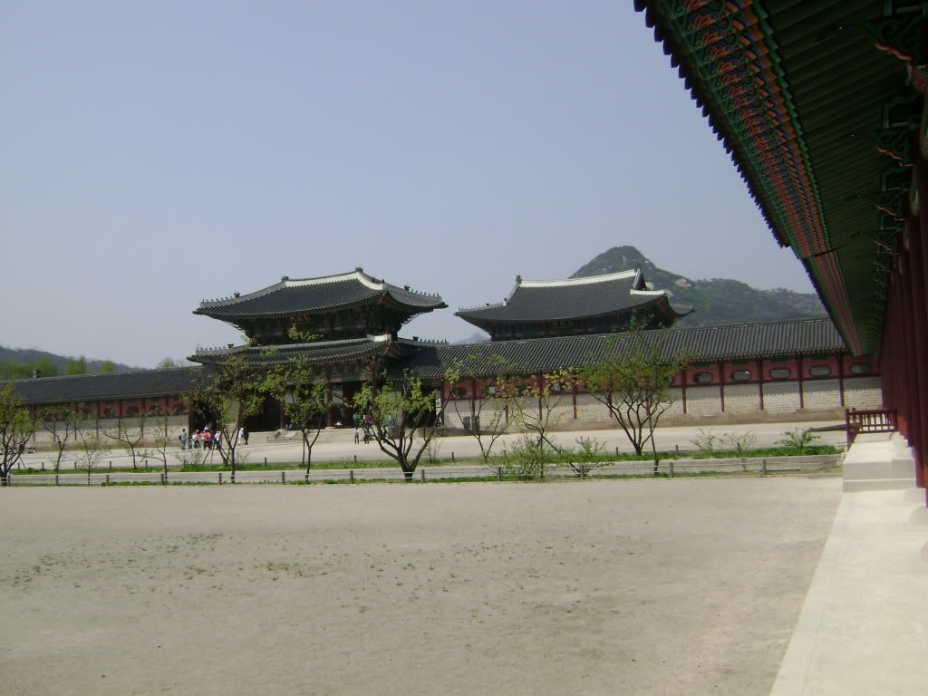
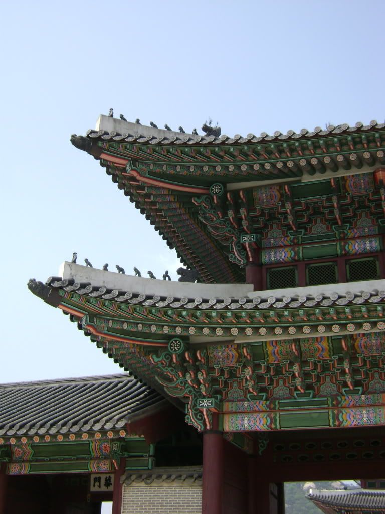
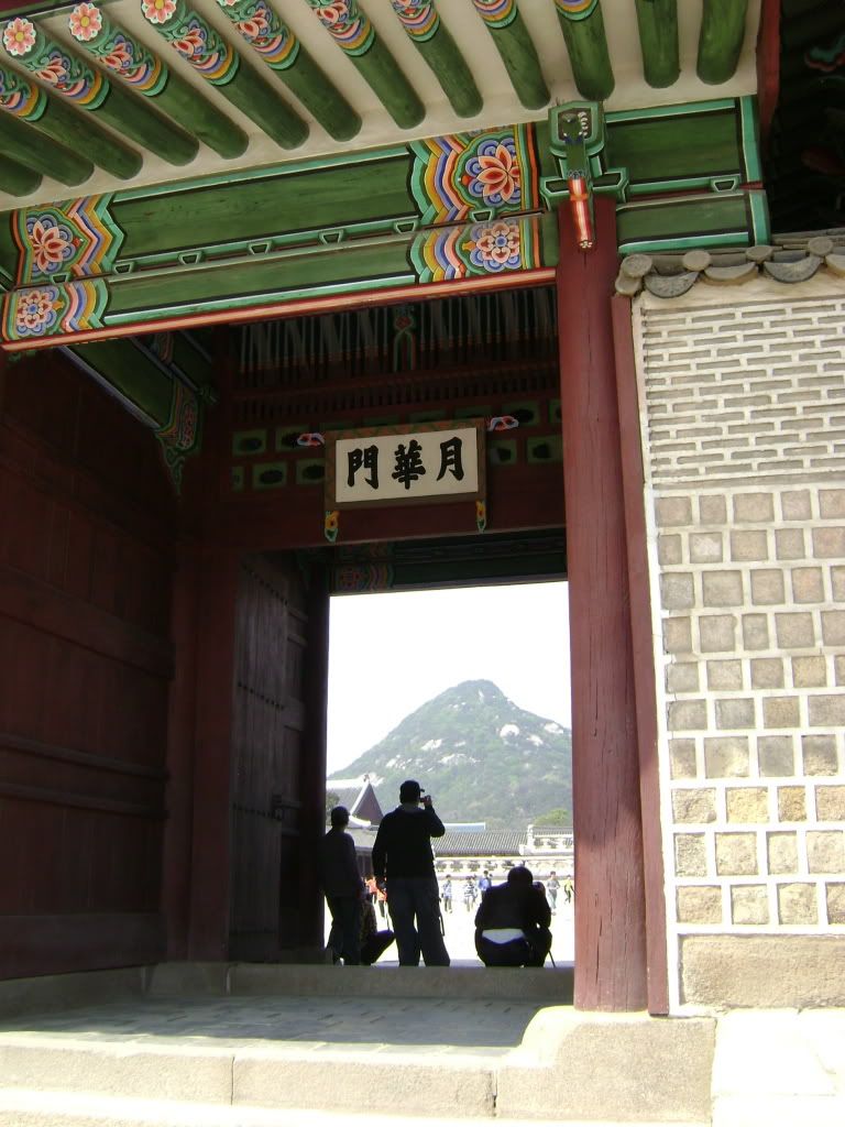
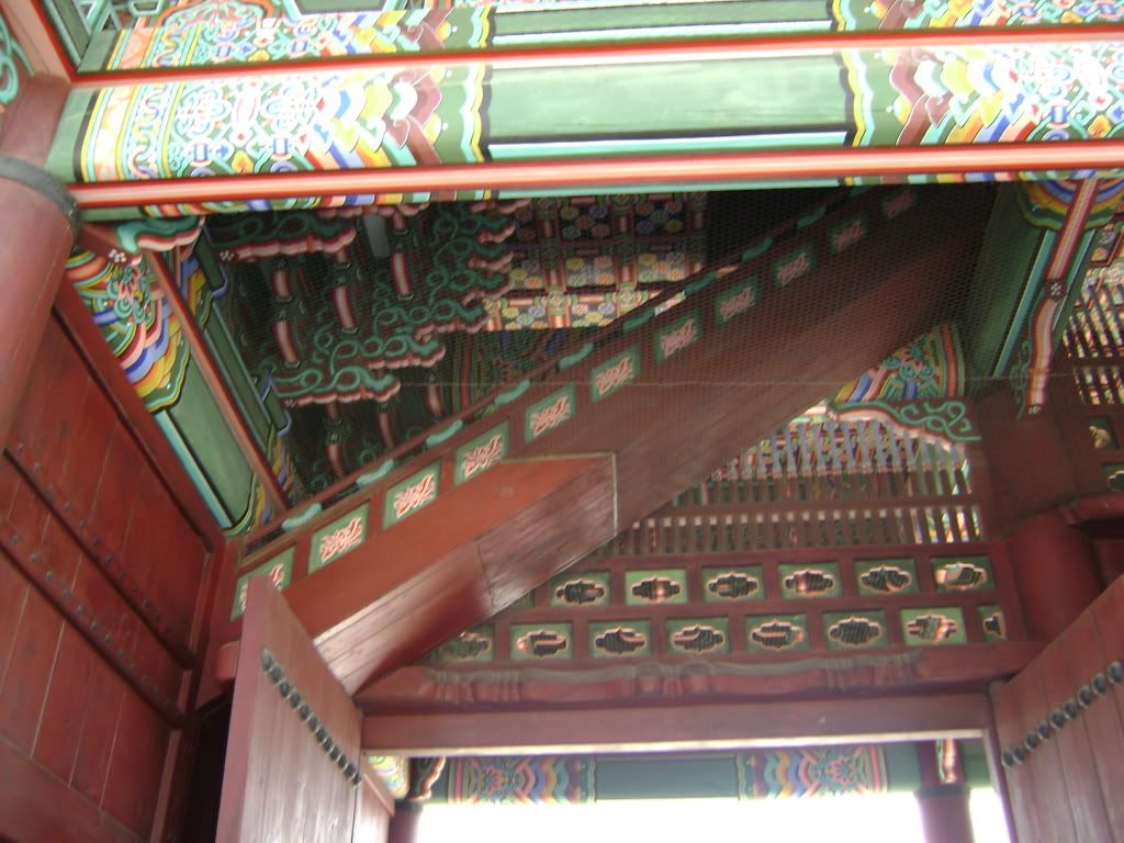
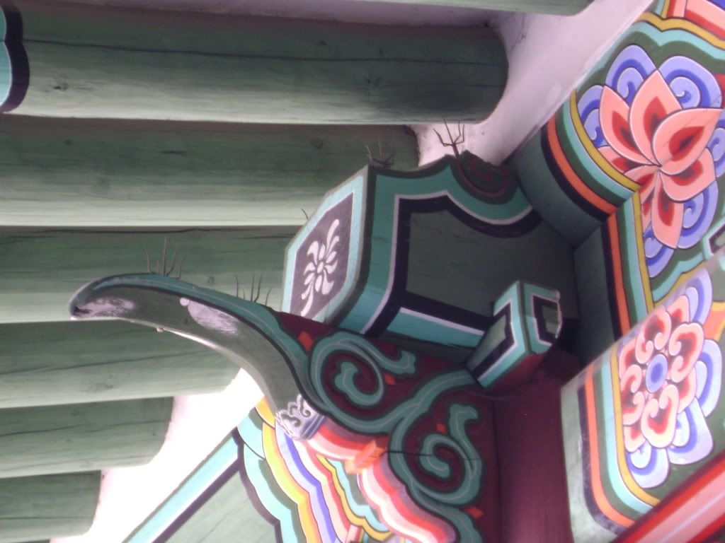
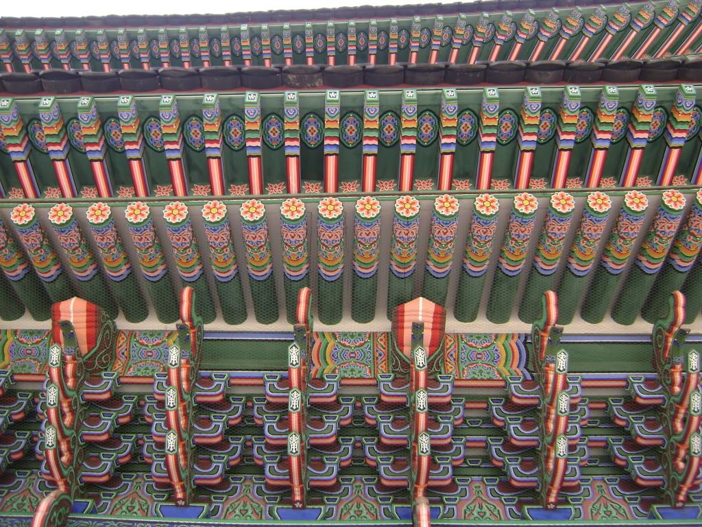
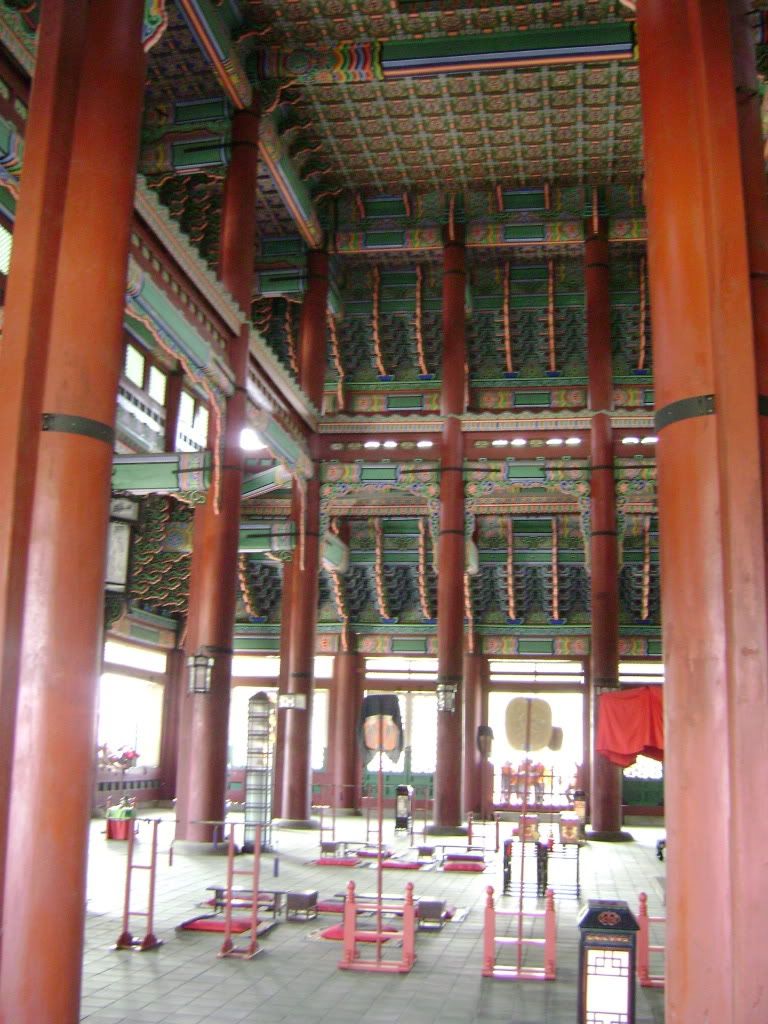
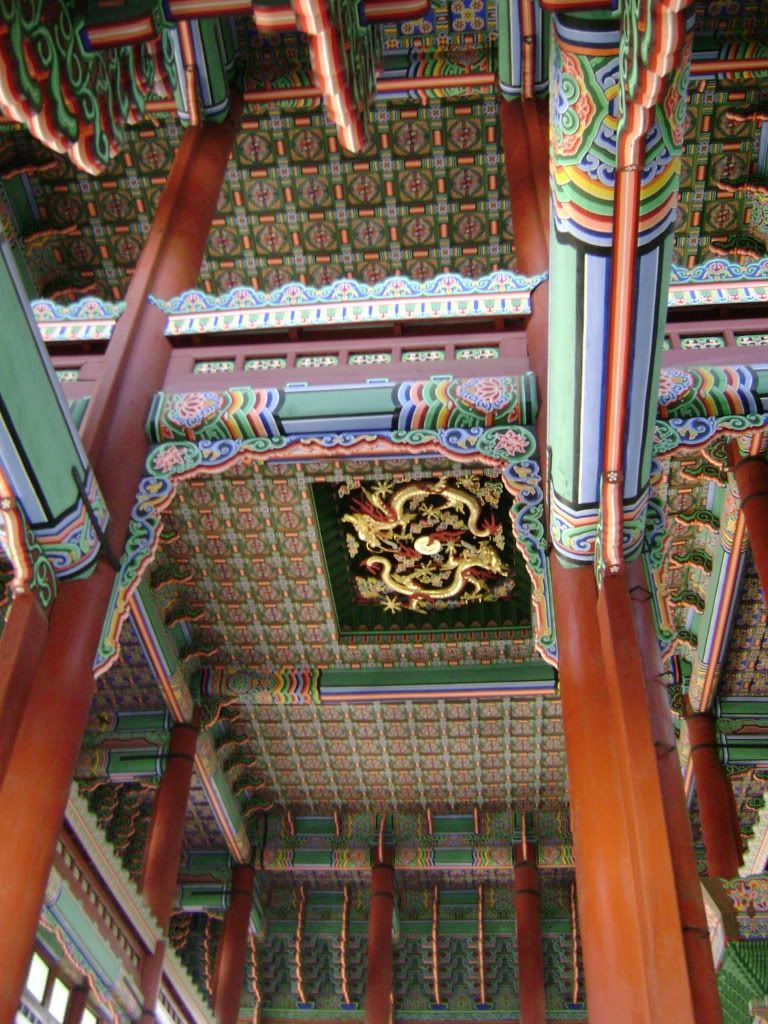
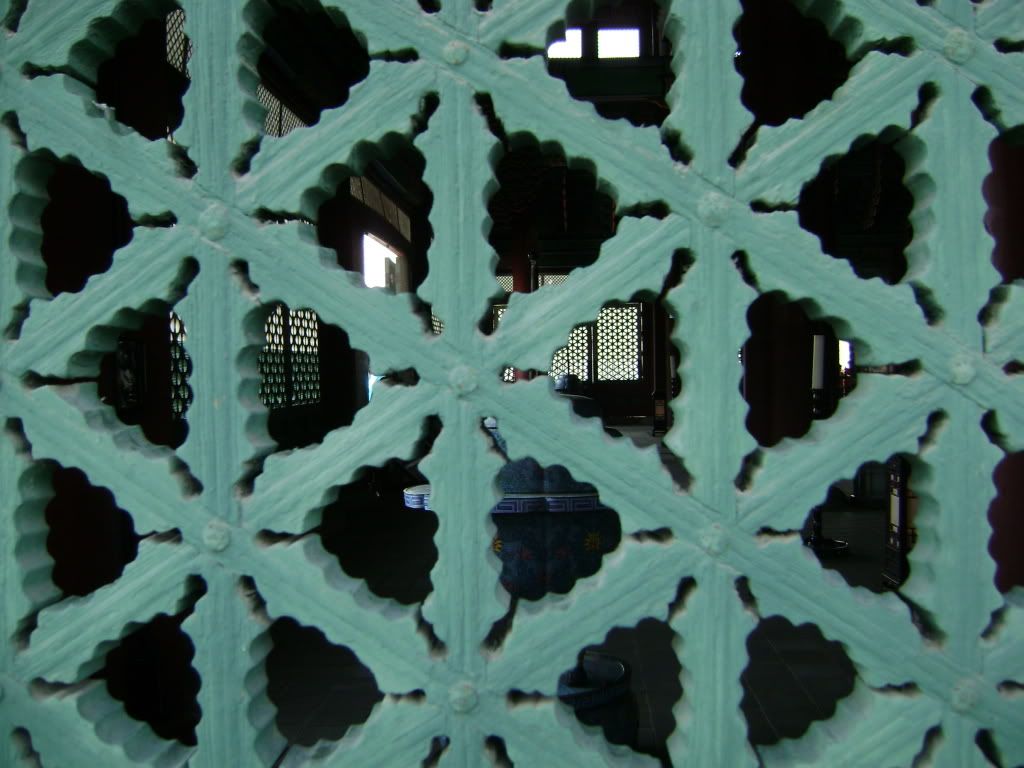
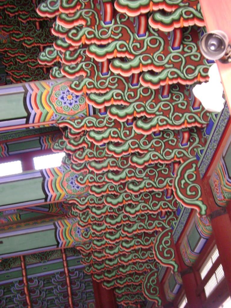
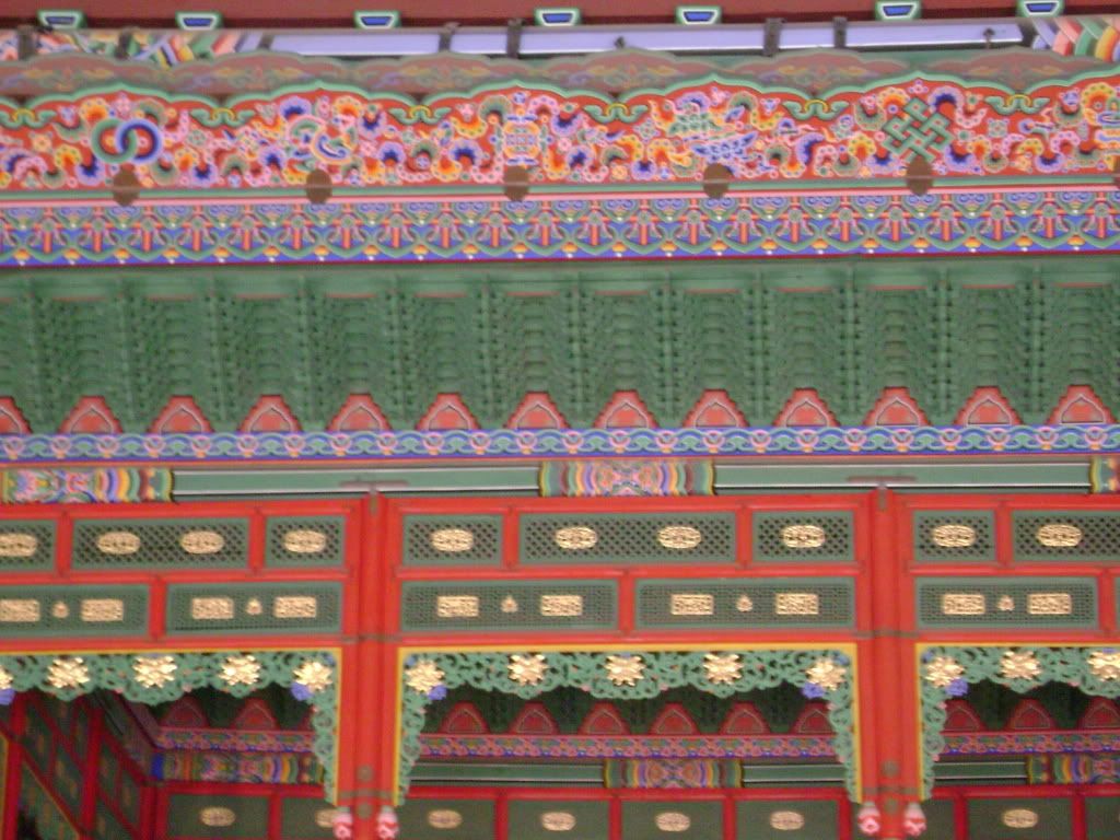
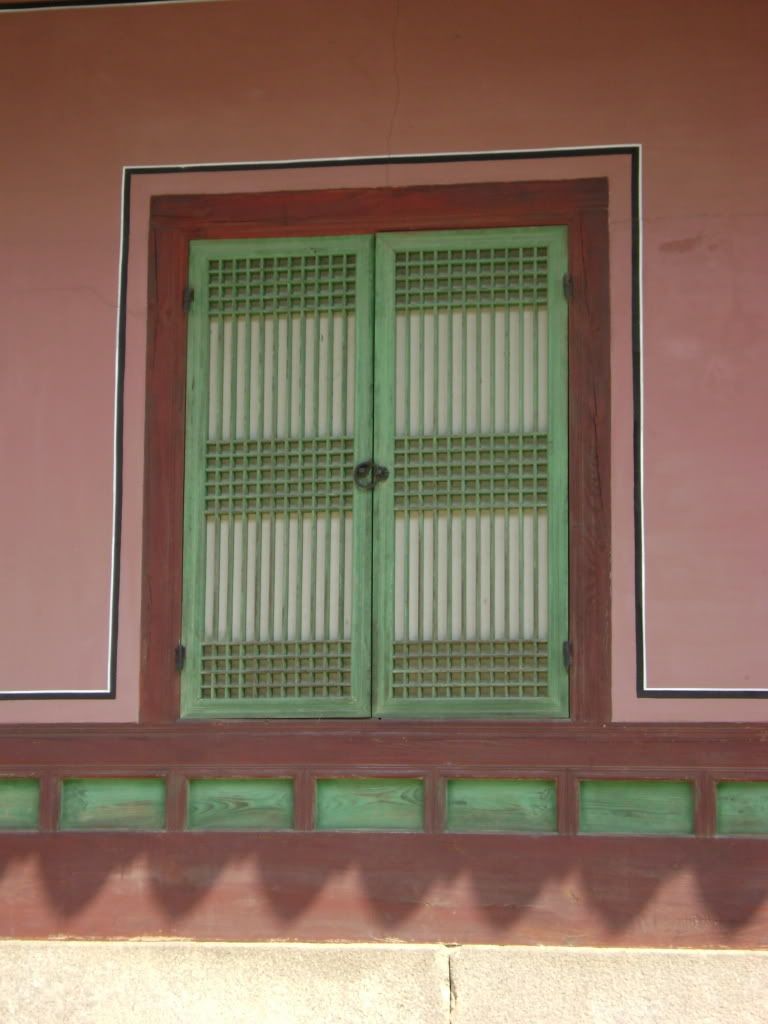
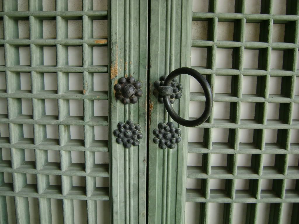
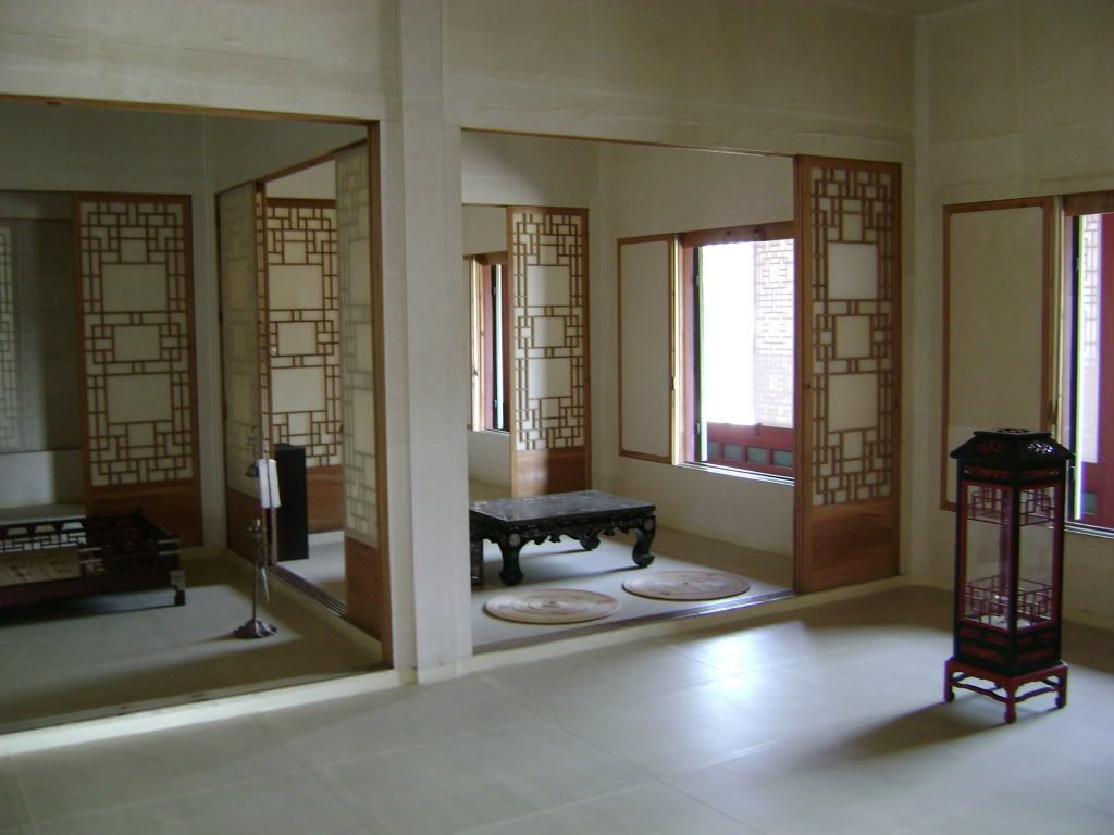
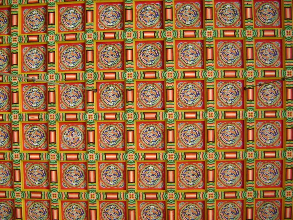
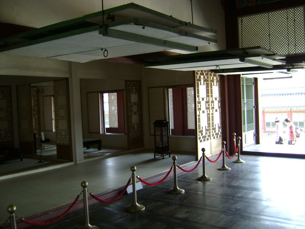
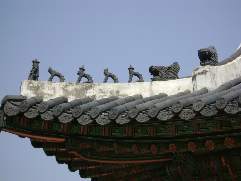
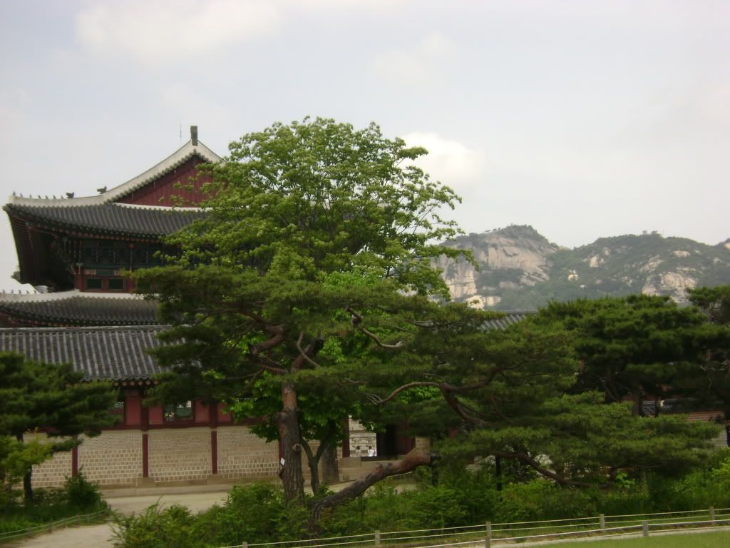
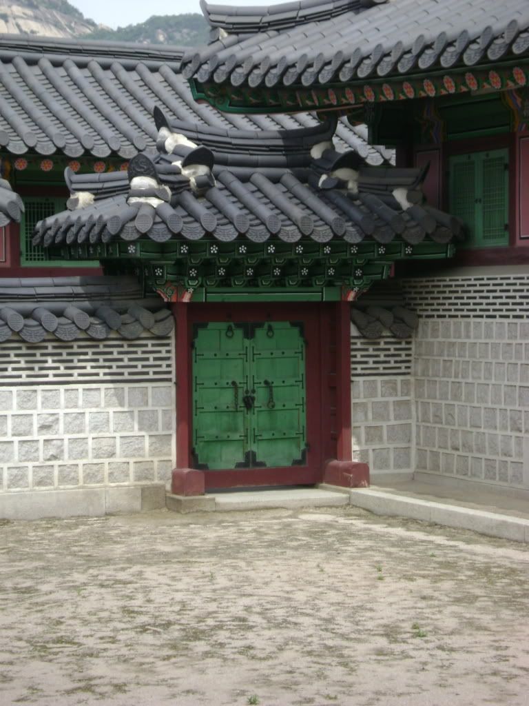
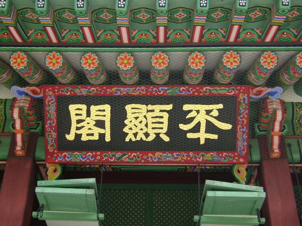
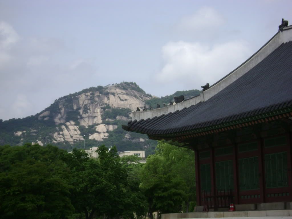
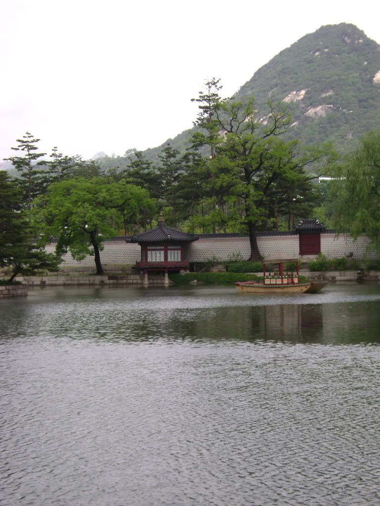
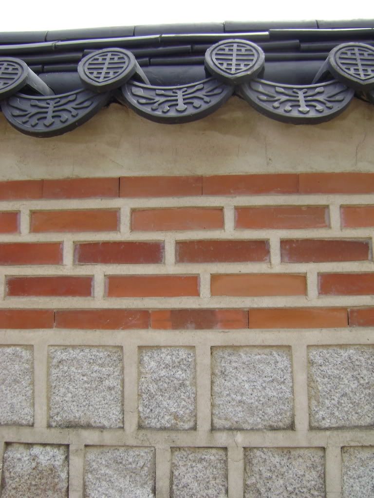
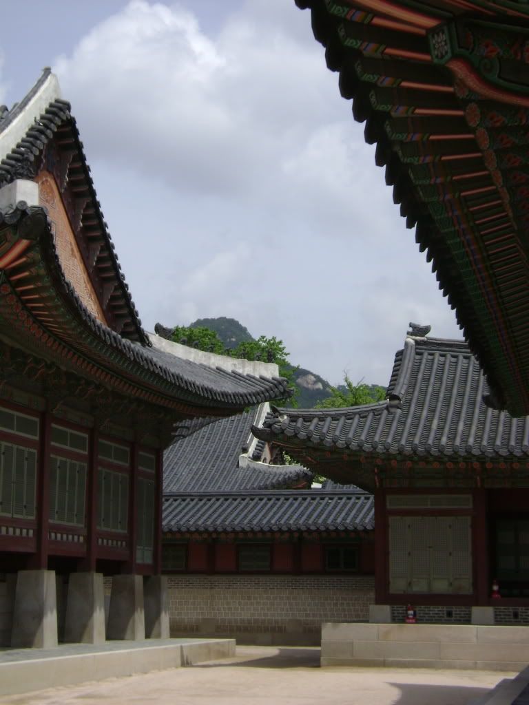
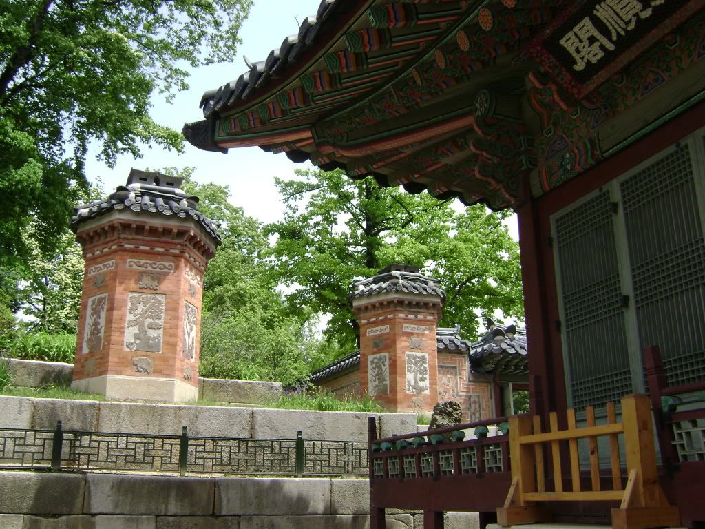
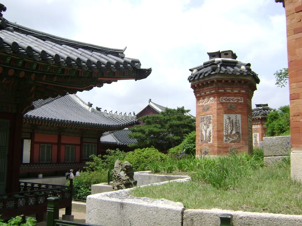
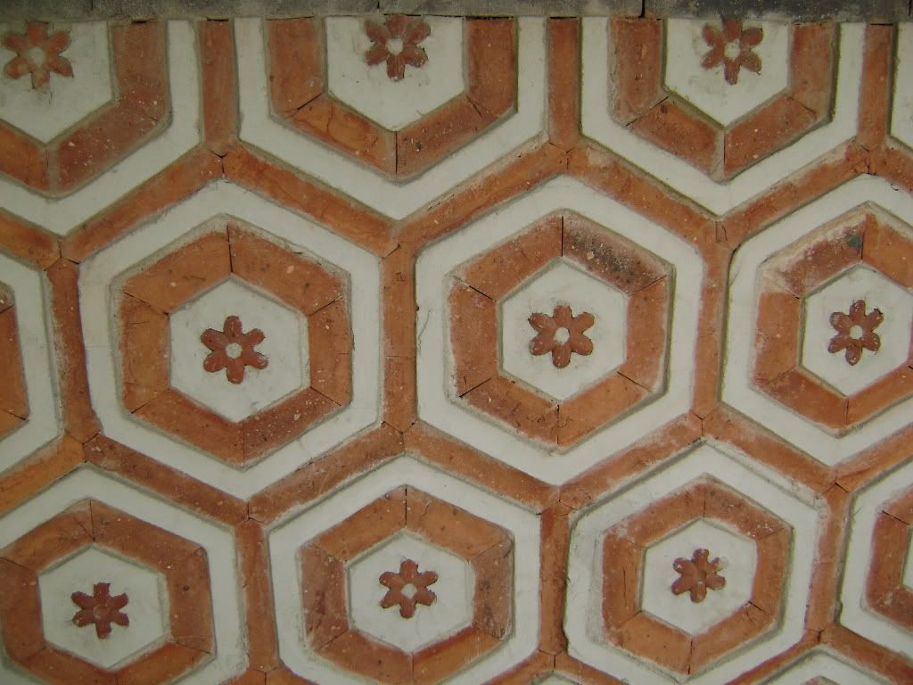
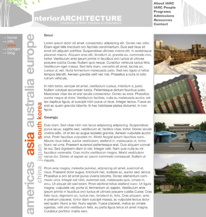
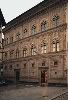
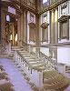
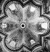
In class we have been discussing where East meets West, especially centered around the concept of Japonisme, or the influence of the arts of Japan on those of the West. While not Japan, I wanted to check in to see what was going on around the same time in history in Korea. Lo and behold, my favorite palace, Gyeongbokgung, was being rebuilt. Located in northern Seoul, Gyeongbokgung was first constructed in 1394 during the early days of the Joseon Dynasty, which lasted up until 1910, when the Japanese invaded. It was burned down in 1592 by the Japanese, and then rebuilt in 1867, so just after other "palaces", like the Crystal Palace. I'd like to juxtapose the two because, as you see in the pictures below, craft was a huge deal in Korean architecture. That's not to say craft wasn't a main focus in the Crystal Palace, but the mass-produced and machine-made elements of buildings like the Crystal Palace couldn't hold a match to the hand-carved and hand-painted elements of the Korean high style. Just think of the manpower it took to build such a complex, and yes, it was a complex-- in the end of its second construction, Gyeongbokgung featured 330 buildings with 5,792 rooms over 4,414,000 square feet. I walked around it two or three times, it's gigantic.
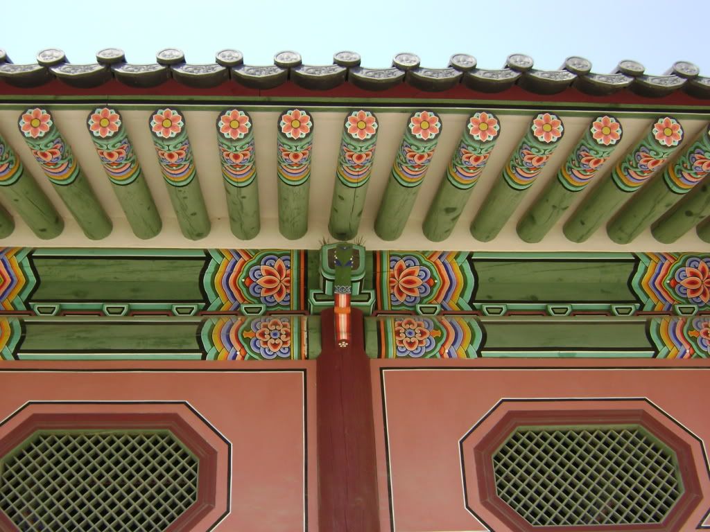
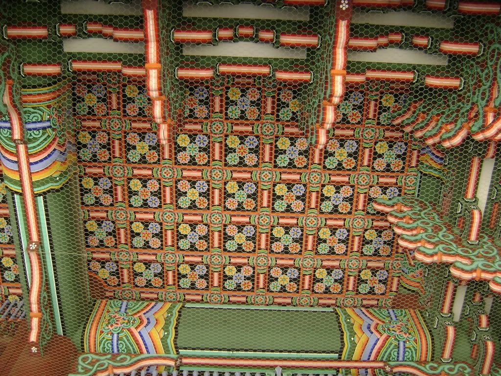
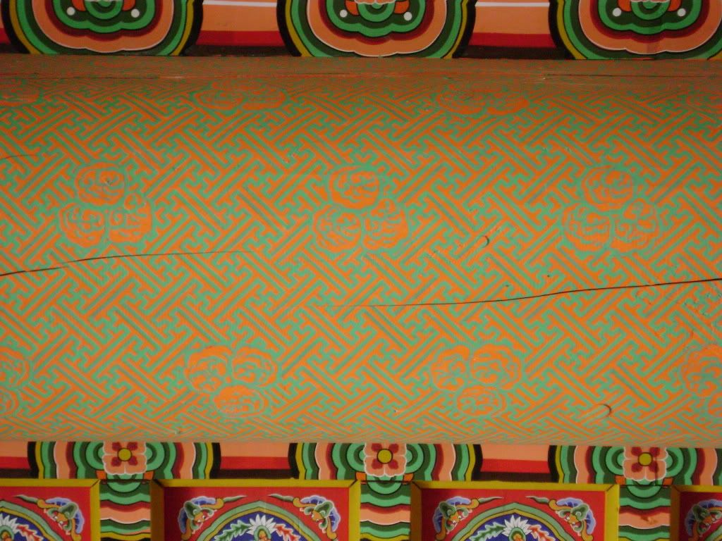
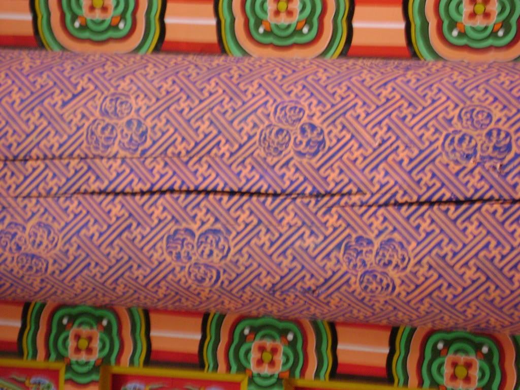
I'd like to point out the decorative elements, some of which doubled as structural elements. I read somewhere recently that up until Modernism surface decoration was about the conveyance of ideas, which is especially true in Korea. If one can read a building, then the symbols painted on and carved into the wood were the words, culturally imbued with significance. The symbols ranged, but the one I saw the most was that of the lotus, which symbolized the creation of life and prosperity. Now why would that need to be all over a palace? Hmmm!
I think the other obvious words to toss into the ring are "rhythm" and "repetition". I wish I could add something about the construction since we went over it in my Fundamentals of Building Construction class, but all I've got are names of joints and their Korean translation.
Below are two sets of photos I took, one set on April 18, 2008 (wow, almost a year now), and one on May 29, 2008.
I haven't made any recommendations in awhile, so I'd like to do that as well.
[a] movie OLDBOY I first watched this movie while I was in Seoul, as people were telling me it was one of the best Korean films ever, and I loved it. I didn't fully get it until I watched it again, but that's usually the case with movies that have plot twists as thick and crazy as this movie! It's the classic tale of revenge reworked, about a man locked up for fifteen years then suddenly set free. He seeks revenge, but loses a part of himself in the process. My favorite character is the villain, he's such a wonderful, maniacal creep. Trailer below.
[b] book CAT'S CRADLE I love a good book that messes with your mind, and Kurt Vonnegut has always been really good at that. This was my first Vonnegut book and I'm really glad it was-- it was an easy read, it didn't take to long to get through, but the concepts and ideas he puts forth... it's hilarious and sad at the same time. And frightening. I think the end two pages are just about the best thing I've ever read.
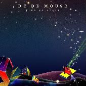
[c] music DE DE MOUSE A solo electronic artist from Japan, DE DE Mouse is fresh. The songs have such a good beat and flow together well on this album, tide of stars. The concept is tight and it's something you can dance to, which is always a plus. If you don't like electronic this certainly won't be for you. I have an irrational love for electronic music, and Japan has so many artists that do it so well. Preview a song below [my favorite song]. I might be able to help you find the album if you're interested.
First of all, I wanted to post the revisions I made to the design for the study abroad website. I expect to be moving into iWeb this week. I've never used it before, and I had planned on using Dreamweaver, but Patrick and Gwen told me iWeb is so much easier, and the website really isn't anything too complicated, so it'll work. Whatever makes my life easier.
I think it still needs work, especially with the kerning of the letters of the country names, but these are details that will be fixed and refined throughout the process of setting it up.
-----
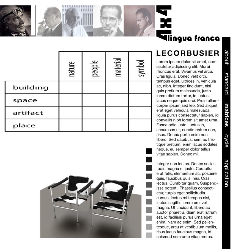
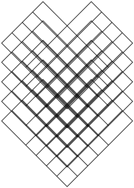
Secondly, I have an update on my research project. I did approximately 1,000,000 matrices only to figure out I needed five, as pictured below.
There would be one matrix for each architect [LeCorbusier, Mies van der Rohe, Wright, Gropius, and Loewenstein]. Earlier I had described four types of matrices that were necessary for my analysis, but the information they produced is auxiliary and can fit into the above matrix. Main points will be highlighted within a short blurb following the matrix, as well, somewhere between 100 and 200 words. And, of course, since I'm interested in exposing the design language of Modernism, I would use my phrase to dissect the information.
lingua franca
What pushes the matrix idea further, though, can be explained by the following image:
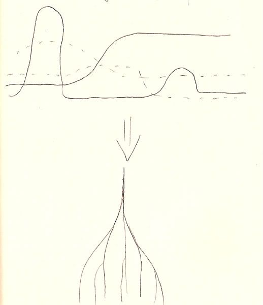
After creating five individual matrices for the architects, I would then, in a sense, stack them. The information that I would pull from this exercise would describe the design cycle in terms of the design language; it's about finding a standard language and the dialects that are mutually intelligible yet also different from that standard. I think it takes the design cycle from looking like the image on the top half of the below scan to looking like the image below it.
Hmmmm... recalls an image I posted earlier on...
Now, the output for this project is also going to be a website. I propose an outline of five steps that would fully represent the project:
describe project lay down the foundation for understanding, including any terms and basic ideas describe standard expound upon why the standard is, in fact, the standard describe architects draw up matrices and make conclusions regarding findings; this part is about the dialects describe cycle layer matrices and make conclusions regarding findings describe application synthesize and summarize
That about covers it for now. Check back later this week for preliminary designs for this website.
Previously I had defined "the shifting image" as a set of images that are overlapped and interrelated that vary on scale from the micro [a detail such as the door handle and how it fits in your hand] to the macro [how the building fits in its contexts, such as how it responds to the building around it]. Now I want to layer another piece on top of that definition, and that's the idea of imageability. Kevin Lynch, author of The Image of the City, who developed the original idea of the shifting image, defines imageability as" the quality in a physical object which gives it a high probability of evoking a strong image in any given observer" (p. 9). Imageability refers to perceptual learning and how we receive, interpret, and store information that we come into contact with through our senses. It's about the hidden forms and scales. After all, architecture, according to Suzanne Langer, "is the total environment made visible" (Lynch, p. 13). In this way, architects are the people who gather information about the many contexts before the building is even designed, and boils all the information down then translates into building form. Thus, the building form relies heavily upon its culture, which informs designers what is acceptable and what is not, availability of materials and the sense it makes to use them, site conditions [including weather, sun patterns, topography, demography, etc], and precedents.
Questions that arise as a result of integrating imageability into the definition:
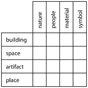
Which layers does/do [nature/people/material/symbol] occupy? How are these layers synthesized? What do these layers say about the society who constructed them? Which objects evoke a strong image?
NATURE
To answer my first question about which layers does nature occupy, it seems to occupy a small amount, or, at least, less significant ones, but this is always subject to fluctuation. I think in the Gothic, Renaissance, and Baroque time periods, we see a movement into the city, but then a movement back out. As people urbanized, they get used to being surrounded by a built environment. They might even develop a preference to being in the city. I remember a fourth year, who studied abroad in Italy, saying Italians much rather stand on concrete than stand in grass. Nature then becomes a commodity, and one goes to the country to get away from it all. It's a familiar concept, as it's something we do in our society today.
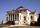
I think this movement starts in Italy, the best model [that is, the object that evokes the strongest image] being the Villa Capra by Palladio [photo 1, below]. The villa was the rural counterpart of the palazzo in urban Italy. The Villa Capra dominates its landscape, and offers views while also making views with the four-porch façade. I think it recalls the ziggurat form that we see in early Mesopotamia, the artificial mountain that rises from the sands to call out to people from all directions. There begins to be a stronger tie to the landscape later in Italy, as we see with the Medici palace where places are designed in the gardens for socialization and activity. The natural environment then becomes an extension of the built environment; one is not just standing anywhere, one is standing somewhere.
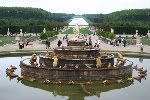
This idea of the landscape being a part of the built environment then moves to France, where it's taken to the extreme, as seen at the Palace of Versailles [photo 2, below]. As I mentioned in a previous entry, Paris [and then Versailles] is the definition of France as a primate city, which became that way through the king exercising his power in the absolute monarchy. This idea manifests itself through the design of the gardens at Versailles. I think it's important to note that the views you get in current photographs aren't the same views as they were during its height: the trees that line the natural avenues that cut through the gardens would've been carefully shaped into box forms. The straight lines, carved trees, and control of water are all indicators of the king's one power, which was such that he could conquer nature.
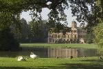
The shaped landscape also takes root in England [photo 3, below], but in a different manner from both Italy and France. Called the picturesque, which also became a popular painting style, the English gardens were made to look as they would in nature, that is, undisturbed and free, but were actually planned to look that way. The best possible image was selected and viewpoints were planted throughout the gardens as little Classical structures, where the person could stand and always see a beautiful scene.
Overall, though, I believe that the layers of the actual built environment [the villas, the palaces, the country houses] dominated the images of the natural environment. The structures spread out and captured as much as the view as possible, as such is the case in the sprawling Palace of Versailles, or by extending upward.
There's a direct translation of this general image into our society. People like to spend time outdoors without the mess, so we see the development of areas affixed to houses, such as decks or pool areas, and then more public spaces such as arboretums, lawns at universities, and playgrounds.
→
PEOPLE
People work within layers of verbs in their environments: living, working, socializing, worshipping, to name a few. These verbs get translated into the built environment through levels of functions: a house is for living, an office is for working, a house could also be for socializing, a church is for worshipping, and so forth. Where these functions overlap, such as the living and socializing in the house, there are distinctions between functions. Public and private are filtered into areas, like in the palazzo, where work and socialization would happen on lower floors, and upper floors were reserved for the family. In terms of worship, I immediately think of Ste. Chapelle, where the lower arcade area was split from the upper triforium and clerestory, the lower for commoner worship and the upper for the king's worship.
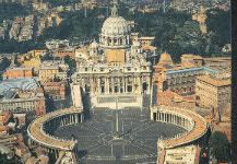
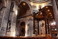
This idea also works on the scale of civic to private spaces. St. Peter's Cathedral best exemplifies this idea; there is a large public space before the actual cathedral that serves as a space for the masses to gather during events to hear the Pope. When the user moves inside [perhaps for worship purposes, but I can't ignore the fact that tons of tourists move through the space, too, with a different lens of seeing the space], the function of the space becomes more personal. While the main interior is large in scale, there are areas that bring the scale down, particularly the baldacchino, which brings the focus to the center.
MATERIAL
Material is all about evoking a strong image in the viewer, as it is the most immediate layer, the layer of contact and of the senses. You can feel stone, you can see color and light, you can hear the echoes off the walls. It's the interface, so I think it's the most important. Material takes on different properties throughout the Gothic, Renaissance, and Baroque time periods. I also think you begin to see light as a material, which indicates that designers are beginning to think more about the site and how best to take advantage of the sun.
In the Gothic era, stone as a material was important. On the exterior, the cathedrals may look heavy, clunky almost, and this is certainly due to the buttresses, but those exist as a support system as it is moved from the interior to the exterior. The interior then becomes about the stretching of stone, those thin columns extending into the heavens. The point was to make stone look as light as possible.
Another reason why the main structures were moved to the outside of the cathedrals were to afford more space for the stained glass windows that are basically the skins of the building. The windows became an important tool as ways to communicate with the masses, who were generally illiterate. They contained Biblical images and lessons. They tie back to faith and memory; the strong image evoked here makes a deep impression in the minds of the architecturally literate [which they all were, people were much better at reading spaces in previous times than they are now], and certain ideas and feelings are then attached to these spaces-- epiphany, fear, awe, perhaps.
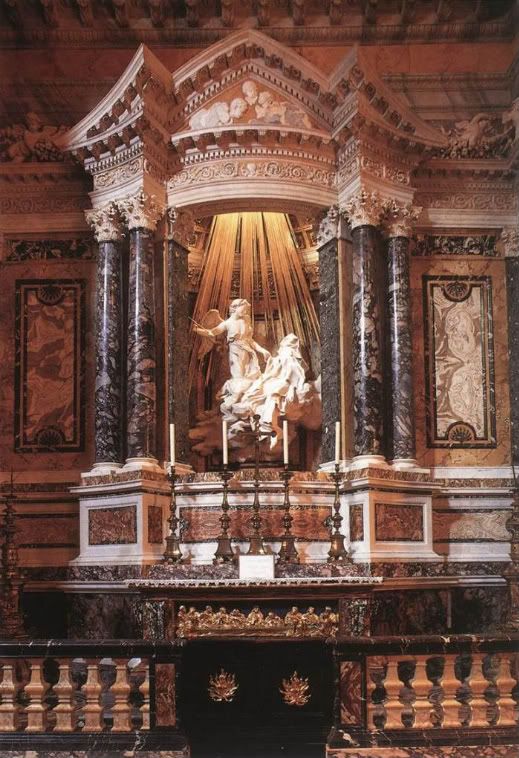
In the Baroque era, material took on a new meaning. Baroque materials were sumptuous, rich, overwhelming. The best example of this would be Bernini's Ecstasy of St. Theresa; the different colored marbles combined with the carved image of St. Theresa resting on clouds and the gold "light" that filters down from the heavens creates such a sense of place, it's singular, unique, a strong treatise on faith and the Baroque.
SYMBOL
Here I think the question What do these layers say about the society who constructed them? is most important. I thought of many word groupings that could be applied, including religion/god/faith, interior/exterior, urban/rural, and defining rules/breaking rules, all of which reference ideas already outlined above.
In terms of religion, symbols were used in Gothic cathedrals to tell the masses of the Bible. Every surface became a blank canvas for artisans to write upon, and no surface was left untouched. As seen in class, even the capitals on columns were carved with figures, showing scenes from the Bible. We see this as well on the stained glass windows. The scale of these cathedrals, which towered over the rest of the city in which they resided, speaks to the fact that religion was the key institution during this time period.
Interior and exterior boundaries are beginning to be blurred throughout the eras mentioned in this alternatives unit, particularly in the gardens that served as outdoor interior spaces. Gardens became symbols of the king's power, as was the case at Versailles, or served entertainment purposes, as they did in Italy. The urban/rural duality ties in with the idea of interior/exterior, too. The villa form in Italy, for example, was like a palazzo, except in an urban context. Countryside retreats were about exactly that, retreating from the city.
Finally, there's this important idea of defining rules versus breaking rules, which references the design cycle. Certainly there were rules during the Gothic period, which were vastly different rules than during previous periods. But the rules didn't become so important again until the Renaissance, when we saw a rebirth of Classical ideas. As there was very little written about the built environment during the Classical period, though, I think Renaissance designers had much greater latitude to interpret the evidence to suit their needs and contexts. People then began to codify these rules, and there arose certain expectations for building types to look a certain way. Mannerist designers began to break these rules; my favorite example of this would be Michelangelo's Laurentian Library stairs. The surrounding envelope of the space contained Classical elements, but with a twist, such as the columns that were embedded into a space carved out specifically for them, instead of being surface treatments as pilasters. The Baroque operated within the same sets of rules as the Renaissance, but broke them, perhaps as statements of originality or commentary and reflections on themselves.
Lynch, K. 1960. The Image of the City. Cambridge: The M.I.T. Press.
-----
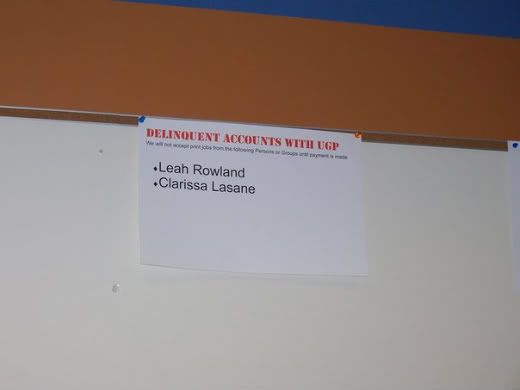
On a side note, Stephanie, who has been my BFF throughout this whole iarc gig, sent me some photos, and this one in particular made me lol:
For awhile I was on the lam, apparently not paying University Graphics & Printing for a print job! I blame this on a club I was with back in the day, but it's still hilarious to think I was a fugitive. It eventually caught up with me in a dramatic, tearful fashion, but that's another story.
Also, my favorite band, Epik High dropped their album. If I could spread the word and just get one more person into them and buying their album I'd feel quite accomplished. Visit their website here, and below is the video from their first single, Map the Soul. They also have an English language version of this song, which is freaking amazing! Such great lyrics. &hearts