☆ 021 ; more websitin'
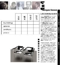
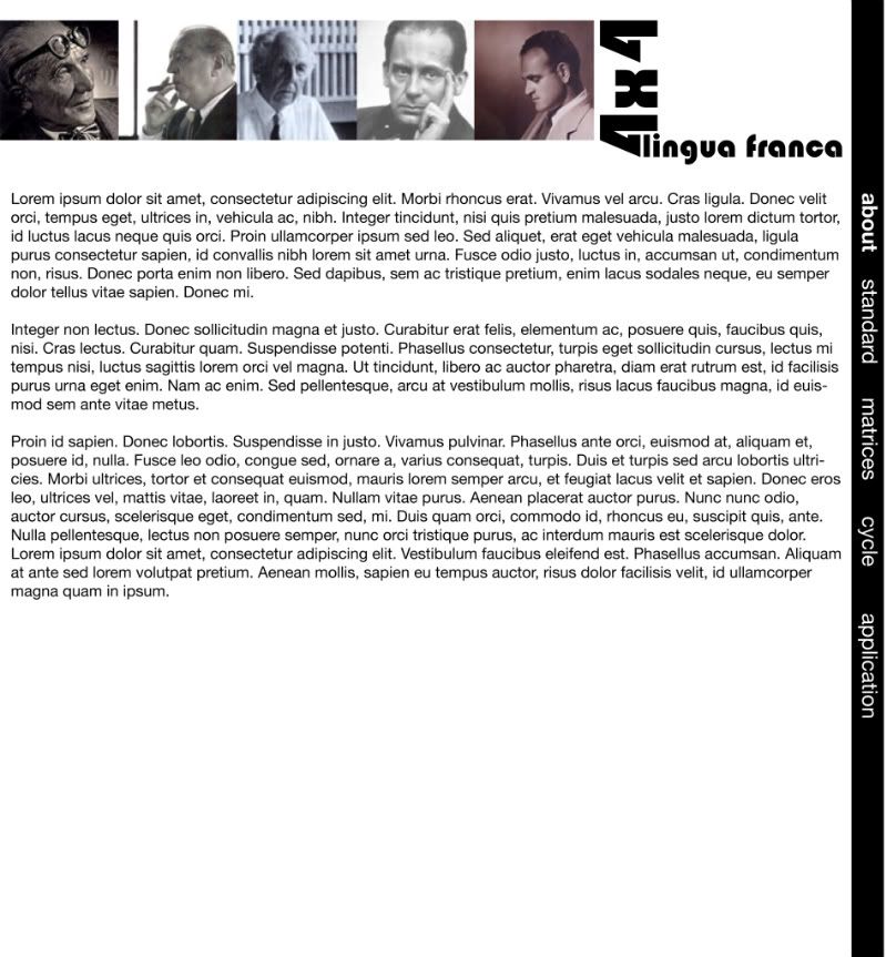
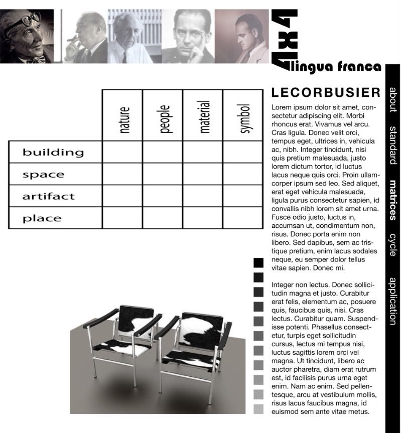
Spent last night sketching and working in Illustrator to create mockups of what my Modernism website could look like. Below are two representations, one of the homepage and one of a matrix page. There is a slight difference in the sidebar length between the two. The little gray-scaled squares on the matrix page would be roll-overs, different photos would pop up based on which square you roll over. I'm definitely not saying grayscale is my color scheme here, I'm just using it as a vehicle to get my ideas across. It's rather bland in just black/white. Also, I want to round the corner of the sidebar.

Yes/no?
Though, looking at it now I have more critiques of it than ever. I don't want people to have to scroll, so maybe I move the text to a roll-over like at the Gothic website. I don't want to clog up the page too much.
Yes/no?
Though, looking at it now I have more critiques of it than ever. I don't want people to have to scroll, so maybe I move the text to a roll-over like at the Gothic website. I don't want to clog up the page too much.
posted by leah at
13:29
![]()


0 Comments:
Post a Comment
Subscribe to Post Comments [Atom]
<< Home