20090430

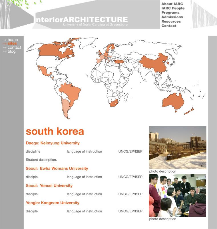
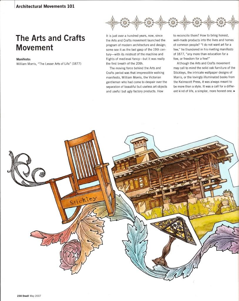
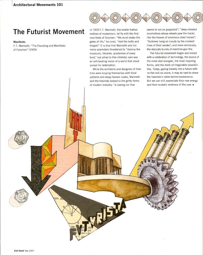
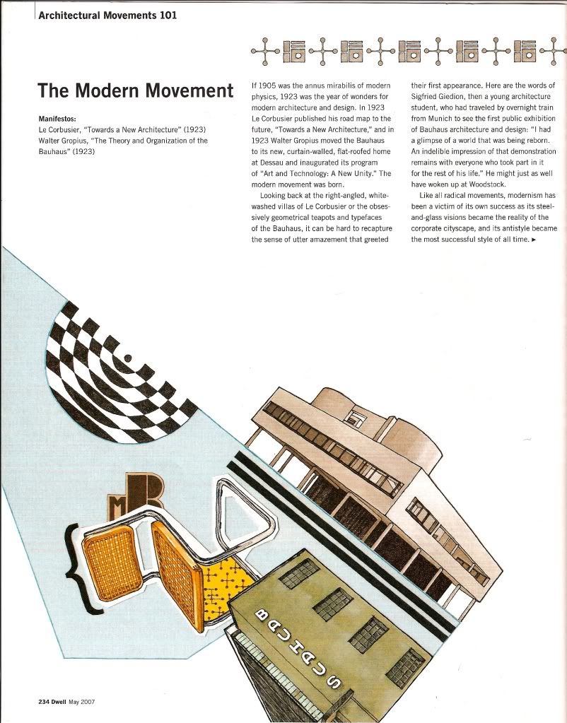
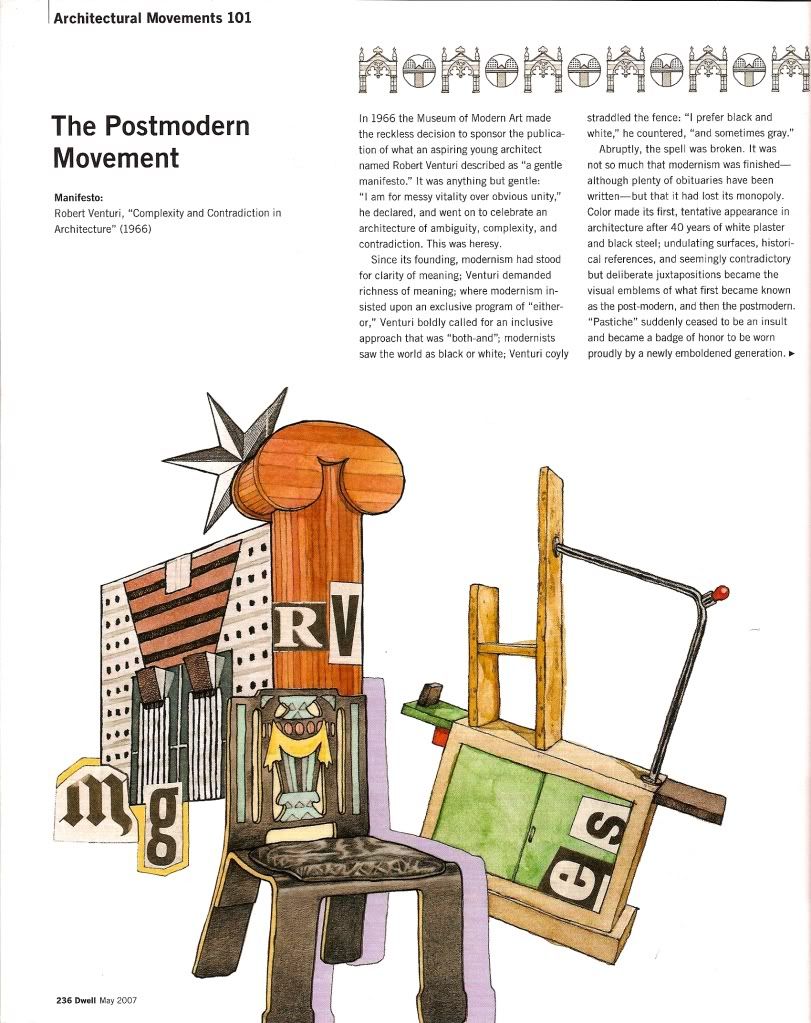
☆ 028 ; explorations: the shifting image

Architecture is the total environment made visible.


Arriving at my fourth and final unit summary, recapping the explorations unit, I have built a definition of the phrase “the shifting image” throughout, stacking new ideas on top of foundational ones as I worked during the semester. The definition, thus far, is threefold, and consisting of:

one a series of images that overlap and interrelate to create a sense of the whole [the shifting image]
two describes how we receive, interpret, and store information that we come into contact with through our senses [imageability]
three images are reinforced through the relationships of parts to parts and parts to the whole on a multitude of scales [element interrelations]


Lucky for me, I think the fourth part fell in my lap during class recently, when we watched and discussed Charles and Ray Eames’ short film Powers of 10. The message that the Eames were expressing within that film fits perfectly upon the framework of the shifting image, and ties all three definitional parts together in a way that speaks to me, as a designer.


The Eames point out that there are many images that a person, a building, an object occupy, from the smallest scale on a molecular level to the largest scale on the universal level. These things inhabit a series images that humans, as a part of those images, come into contact on a regular basis, and thus shape our perception of the images. Since we can have an influence on how most of these things appear, we can create our own images and positively or negatively influence our own perceptions, and create holistic and meaningful environments. This is an important idea because I think the Modern designers are the first to challenge the perceptual status quo. Their works may or may not integrate all parts of the series of images, but I think they challenge how we receive, interpret, and store information, and understand the importance of elemental interrelations.

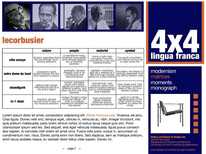
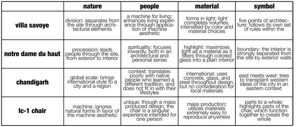
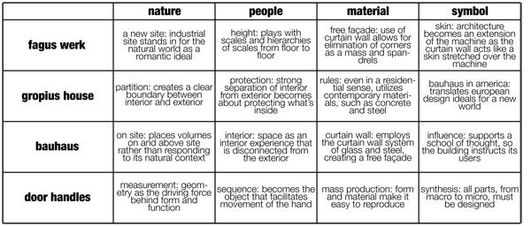
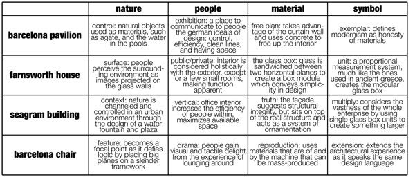
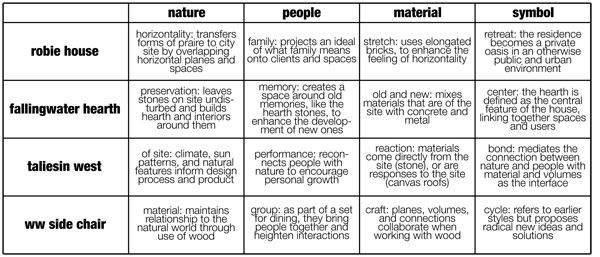
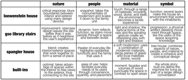
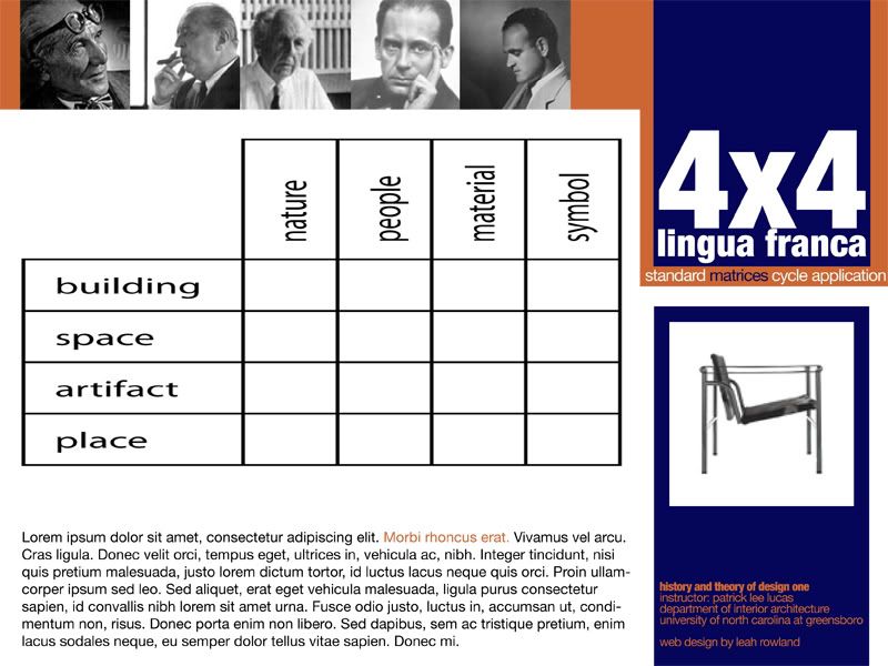
Having prescribed myself to a certain format of writing in previous unit summaries, I would like to try something different, as I have developed a sharper definition of the phrase the shifting image, and would like to look at Modernism and its reactions in a more holistic manner. Taking into account the ideas behind The Powers of Ten in conjunction with Kevin Lynch’s writings in his book The Image of the City, it seems terribly obvious to me that the aspects [people, nature, material, and symbol] are more integrative with the objects than I had implied previously. I had described the aspects as applications of the objects, when, in fact, they are functions; what I mean by that is that the objects do or do not display qualities of the aspects because the designers created them in that way, but that the objects are inherent products of the aspects, and their success is due to careful analysis and planning on the part of the designer. Where objects fail to perform their functions occurs when a designer omits information important to understanding who, when, where, why, and how the aspects interact to create opportunities for the objects, before and after their conception.

Buildings are not idiosyncratic private institution: they give public performances both to the user and the passerby. Thus, the architect’s responsibility must go beyond the client’s program and into the broader public realm. Though the client’s program offers the architect a point of departure, it must be questioned, as the architectural solution lies in the complex and often contradictory interpretation of the needs of the individual, the institution, the place and history. The recognition of history as a principle constituent of the program and an ultimate model of legitimacy is a radical addition to the theories of the Modern movement.
Richard Rogers


VS


Where form comes from I don’t know but it has nothing at all to do with the functional or sociological aspects of our architecture.
Phillip Johnson


What Rogers states describes a more complete understanding of the shifting image as integral to understanding design, whereas Johnson discards it as a social construct and therefore having no legitimate meaning in the process of conceptualizing, designing, building, and inhabiting. It comes as no surprise to me that some of the objects that follow this more prescriptivist form of design fail when they move from theory to practice and come into direct interaction with the aspects. Within the Modernism movement there are successes and failures; this movement is far too broad and varied to make a generalized statement about the “style”. Being Modern wasn’t a label, as was suggested by Hitchcock and Johnson in their book The International Style, but were responses based on an individual designer’s logic. The criticality of these responses is evaluated by its success in integrating the aspects; in my opinion, a design can only achieve its maximum if it fulfills its functions in a practical manner. I’m not saying that style should be discarded, as part of the function is this social expectation of what a space or thing should look like, but that the implications of a design throughout the myriad of images makes sense [that they perform according to the program’s standards, but also acknowledge the contexts that surround them].


?


I think this idea of the foundation for the development of “crap in the suburbs”. Reactionary movements to Modernism become so much about the statement that it loses its identity. These reactions become the norm because they’re accessible to the masses. Modernism set the baseline for creative people to come in and express new ideas, reactions, such as Postmodernism, took advantage of prior theories, perhaps more as design exercises, which led to the lack of identity. By the end of the mid-century, such reactions became acceptable forms of expression, though, and gave rise to the “crap in the suburbs”.

As designers, I think the only way to combat such banality is to acknowledge our roots but to design in an innovative manner that challenges our standards while integrating the existing and future images. I’ll extend the requirements to all objects, that they should have commodity, firmness, and delight in order to be successful and meaningful, but also to lay over it this idea that objects should be reflections of their contexts as to add to the quality of our lives.

20090420

☆ 027 ; please have a seat


I was just talking to my sister about chairs, and how I thought it was slightly crazy that I know the names and designers of most of the above objects, and she said she thought it was crazier that she knew the same because I am always pointing them out when we watch movies together.

Now I wonder why they use them in movies, especially in more styled and expensive-looking interiors. Probably for that very reason-- to show that the owner of such a space has taste and money. Then I'm led to think, how can modern design be for all if I can't afford a Barcelona Chair or to make my interior fit for a Barcelona Chair? I don't think it'll look very good next to the futon and plywood entertainment center.

20090419

☆ 026 ; plastic, fantastic!

I've got some official business to do today-- below are download links to PDFs of the outlines for the 4x4: Lingua Franca website and the IARC Study Abroad website, and a database of the schools we can send our students to. These represent the content that will be going on the sites.

001002003


I was also thinking while I was making the database that there has to be a cool way to represent this, so I modified the study abroad site a little with a map graphic. The graphic will be clickable (I hope iWeb can do this). The dark orange designates countries that have universities that UNCG has a direct exchange with, the middle orange for UNCEP connections, and light orange for ISEP connections. I'm thinking that they should be all the same orange, though, as I will be delineating which countries have which connections in the written portions, and some countries have both UNCEP and ISEP connections. And I didn't notice this until now but I totally spelled "discipline" as "disciple" roflwut.


-----

Time for some more recommendations! I don't have a book this time around because I haven't really had the chance the read, but I've got a wonderful artist and a movie I want to share.

[a] movie ROUGH CUT This is a recent Korean action movie starring So Ji Sub, who is just amazingly awesome and play his part so well. I can't find an English subbed trailer, but it's about a failing movie star who can't find someone to act with him in an action movie because he's too much of a liability. He asks a gangster that he had met previously, and the gangster agrees only on the condition that all the fight scenes are real. It follows the rise and fall of both characters, and the ending is just stunning.


[b] music single チャイナ・ディスコティカ BY AIRA MITSUKI Jtek fun explosion! I love listening to her voice and the beat and flow of the songs on this single. It's addicting and makes me want to dance and wish I could sing along. Her whole discography is pretty swell but I especially like this song.

20090418

☆ 025 ; reflections: the shifting image

For the foundations unit, I started with a basic definition of “the shifting image”, a key phrase from Kevin Lynch’s book Image of the City. This phrase refers to the idea that an object [whether it be a building, space, artifact, or place] is a series of images that overlap and interrelate to create a sense of being in a user’s mind. For the alternatives unit I added on a layer describing imageability, or the perceptual experience describing how we receive, interpret, and store information that we come into contact with through our senses. As we arrive at the end of the reflections unit, I want to build upon this definition of “the shifting image” by introducing the idea of element interrelations.

The elements that Lynch refer to in his book include paths, edges, districts, and nodes, which describe his city image, but I think can be connected to the world of architecture and the objects people produce, or at least new elements can be invented to illustrate the same sorts of ideas. Lynch defines each element, but then goes on to highlight the importance of the relations between unlike elements, as “such pairs may reinforce one another, resonate so that they enhance each other’s power; or they may conflict and destroy themselves” (pp. 83-84). In other words, there are concrete and abstract relations between elements that shape the image and thus the experience we have of the object. This idea is key throughout the aspects [nature, people, material, symbol], and I will go into greater depth below.

For my purposes, defining a new set of elements would be more apt for the type of objects I will be looking at. I think forms, faces, scales, and ornamentation best describe the sorts of interactions the built environment has with the aspects.

FORMS describes how the object engages (or does not engage) the aspects, as forms create or block off space
FACES describes the surfaces of the forms, which are the visible parts of the forms, and become an interface between the aspects and form
SCALES describes how the aspects relate to the objects, and how the forms and faces of the objects relate to each other
ORNAMENTATION describes how designers mediate between elements, aspects, and objects, and create a dialog that is essentially a snapshot of its contexts


NATURE

The reflections time period is seeing a great shift from rural living to urban living, due to the Industrial Revolution, which shifts a nation’s economy from a primary, or agricultural economy, to a secondary, or industrial economy. There is a huge influx of people into cities, most notably in Europe and America. The key city in the United States at the time was Chicago, which saw a rise in population from 300 in 1833 to 2 million in 1900, even surpassing the population of New York City. Accordingly, as urban areas become dense, the environmental context loses out on a natural site aspect and adopts an architectural site aspect. Chicago demonstrates this idea the best, especially after the Great Fire of 1871, which destroyed an area of Chicago four miles long and three-quarters of a mile wide. With a clean slate, so to speak, and driven by other factors, like higher rates of land price, the advent of a safe elevator, and iron skeletal construction, innovators flocked to Chicago to begin to rebuild. Here we see the birth of the skyscraper.

The skyscraper is important in the development of the American city as it reorganizes the urban center, and in this way the natural site aspect disappears and is replaced by “the concrete jungle”.


The Reliance Building best exemplifies this movement into the urban environment, and its implications are vast and far-reaching. It is a Chicago hallmark, designed with Burnham and Root and constructed between 1883 and 1885. In terms of form, the basic unit that was already defined as the form for the skyscraper is modified; the form is still blocky and heavy, but a geometric undulation is introduced to help break up the space and create more faces. The faces, or the façade, is fluid, and because of careful application of scales and ornamentation we can better understand the relation of the forms to the aspects. There is a strong horizontal feeling, as similar segments are banded together across the faces [windows, ornamented spandrels], which are clearly marked and scaled. It gives us a sense of movement upwards, and the top of the skyscraper stops our eye, like a period at the end of a sentence.


Robie House acts as an interesting foil to the Reliance Building. Another Chicago landmark, Robie House was designed by Frank Lloyd Wright in 1909, and was situated in what was then suburban Chicago. The Robie House is important as a Prairie Style building, as it brings in a sense of nature to an urban area. Where the Reliance building stressed height, the Robie House seemed to spread out across its site, due to the large expanses of horizontal forms. Using both additive and subtractive design, Wright created many of these horizontal forms, increasing the number of faces that the user’s eye would come into contact with. The horizontality of the Robie House also affected its scales; as it did not have to compete with neighboring skyscrapers as the Reliance Building did, and as the use was for a small family unit and not many different kinds and groups of people, the scale is more personal. Horizontality is also expressed through the ornamentation of the exterior; Wright used long, thin bricks and colored mortar to strengthen the sense of the horizontal, as well as group the windows together in bands and cap the forms with concrete.

PEOPLE

As countries open up their borders for economic opportunities, they trade more than goods and services, but pieces of their culture, which then can be reinterpreted in the culture that receives them. This idea is evident in the 19th century with the rise of Japonisme, which is marked by an influx of Japanese products on the Western scene. People were captivated by new ways these new images, and shifted their meaning and appearance as they assimilated the images into their own culture. These Japanese products introduced a new way of seeing things in their simplicity of form, in the way that line defines shape, muted color palettes, materials, patterns, and thematic devices.


I think this opening up is important as it marks a time when different cultures began to come into contact with each other. The images that a certain culture prescribed to itself became under influence by images from a new culture. Japonisme is not the only response to such events; it is a two way street. As Japan, Korea, China, and other countries opened up, they “modernized”, which is to say they became more Western on the surface. New building types were introduced in Eastern countries as well, which did not really take root until about the turn of the century. But nowadays we are seeing more of a political and cultural shift to these Eastern countries, as we receive more goods and services from them that shape our world today, including products, food, and media.

MATERIAL

During the 19th century we saw a rise in the number of styles, and revivals of styles, all of which had different ways of how they treat the faces, or what their systems of ornamentation are, which is also a key element in understanding how the shifting image relates to the aspects of design. In keeping to a handmade aesthetic, ornamentation is a huge part of telling the story.

”The right question to ask, respecting all ornament, is simply this: was it done with enjoyment?”
John Ruskin,
Seven Lamps of Architecture


The story gets complicated, though, as there is a plurality of choices, but I think what we see throughout the styles is an adherence to the idea of holistic design, that there is a unity in all the arts, and a space exhibits the same qualities throughout all its component parts.


The best example of this idea is the Peacock Room by James McNeill. Colors, materials, forms, lines, shapes… in other words, the elements and principles of design, were all synthesized to create a fluid space. Each part corresponds with the whole, and makes a holistic environment. The walls are even covered in art that correspond to and help set the mood of the space. Another way to put it, I think, is that there is a layering of images going on here. Art would be one image, lighting another, and so on and so forth. The imageability of the space is increased, which aids our understanding and interpretation of it, as these images are matched up in this holistic way of design.

SYMBOL

I think the critical idea here is the rise of the machine and people’s reactions to new technologies. The people of this time period are poised to move from a more reflective view on architecture, relying mainly on past styles [revivals] to a more explorative view on architecture, creating modern spaces [movements]. The main question rotates around the word pairing form-reform: do we continue to make things by hand, or do we use the machine in the process? Styles are born out of this question, either taking on the stance that integrity and authenticity only comes from handmade objects [Arts and Crafts, aesthetic movement, revivals], or responding to and accepting the growth of industry in our everyday lives [Modernism].


Architects Greene and Greene understood this concept well. The Gamble House of Pasadena, California, is a landmark in Arts and Crafts design. It projects a solid image, from macro to micro, through forms, faces, scales, and ornamentation, on all aspect levels. From the technique in which the wood is treated, to how the rooms flow into each other, to how the building incorporates itself with its site, the message remains the same.

I think this same concept is seen throughout the reflections unit, too, this strong inclination towards holistic design to reinforce a message concerning an object’s contexts. It is not limited to one type of design or one region, but can be seen throughout. Designing in terms forms, faces, scales, and ornamentation strengthens the image of an object in all of its layers, creating a more clear imageability for us to experience, interpret, and remember our spaces.

Lynch, K. 1960. The Image of the City. Cambridge: The M.I.T. Press.

20090414

☆ 024 ; ok i think i got it this time...

Gahhh, am I going nuts? I must have senioritis. I'm naturally lazy but once I get started it's hard for me to stop. I just... need to get started... earlier. I realize this probably won't be the case. I work better under pressure, anyway.

I've been trying to tie everything up in nice little packages... expanding the study abroad database, working on websites (design and content), lighting research, finishing up my linguistics paper. Still making to do lists because I will forget EVERYTHING.

This entry will cover some of the above. I think I've got a final version of the website design for my Modernism project (and I found an M word for each link...!), and I edited the matrices. These are not full size, so click on them to make them larger. I'm still working on the written portion as I'm trying to get some citations in, because well-chosen citations make your argument stronger, right first-years? :)


In order of appearance...!:


And if that wasn't entertaining enough, have a picture of my cat. She's a little camera shy!

20090406

☆ 023 ; wrap it up!

Alright, so I thought I had six weeks left... but that's actually six weeks until graduation, I have four and a half to finish up my work! That got me moving. I have a lot to do besides my internship stuff, like write a 15 page paper that I haven't even touched yet it's going to be the same topic as my oral presentation so I guess it's half done lol my life and I've been doing some lighting stuff with Tina. But I digress! I took all the information that I had accumulated for the study abroad website and that's mostly laid out right now, but what I want to feature in this entry is the work for the Modernism project. Below you'll find...

WEB MOCKUPS more mockups for the website... I really hope I'm heading in the right direction


MATRICES the matrices for each architect


LeCorbusier


Mies van der Rohe


Wright


Gropius


Loewenstein


WRITTEN INFORMATION non-final information that'll go on the website


download the pdf here


Anddd I really want to thank Patrick for his continued support and input. It's his job and his name is on this, too, so I would watch closely too, but it's been awesome. Thanks to everyone else who has been humoring me and reading this, I appreciate it.

20090405

☆ 022 ; movements

I was looking through old issues of Dwell magazine for neat things to collage when I came upon this article about 20th century design movements that includes an introduction and a summary of seven movements. Since we're on the verge of the 20th century in class, I thought it would be a good time to scan and post the pages here. I thought they were pretty cool, and the illustrations were nice.