20090226

☆ 011 ; output


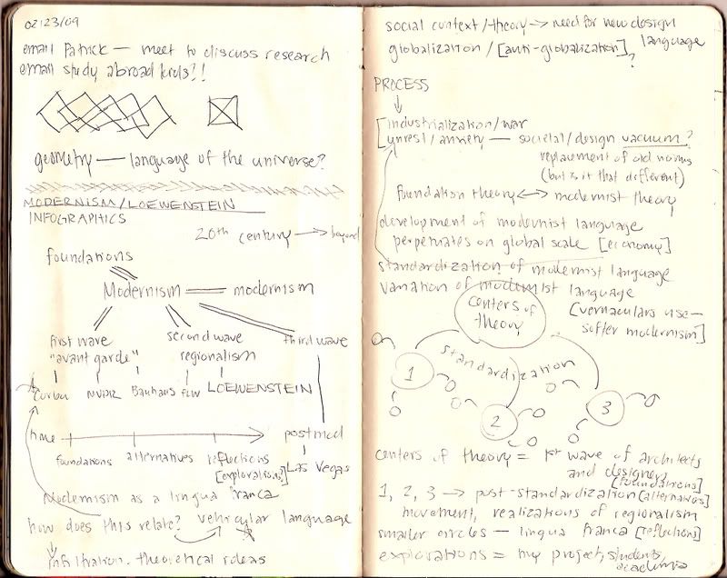
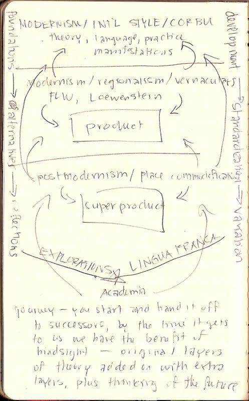
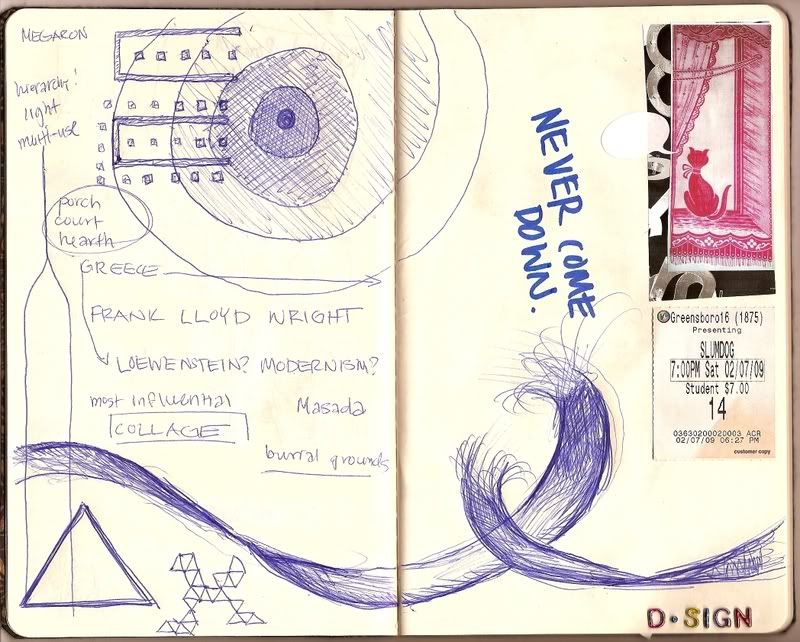
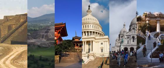
In the course of gathering information for my research project many different, interrelated points became very apparent to me. First of all, it's all clearly related to the design cycle model [above], and I think that that reinforces my concept centering around language-- Modernism being the lingua franca of the architectural world in the twentieth century. Regions vary by many different factors [SHALL I SAY ASPECT, SHALL I? I hope I'm not giving too much away], but as the title of the most "pure" form of Modernism, the International Style, implies, Modernism becomes a global way of thinking, something that links these regions. I think it's best evidenced by the skyscraper phenomenon-- think of the Petronas Towers, Burj Dubai, Taipei 101. These can exist in any urban context, and they become forms that people understand and recognize universally.

As Modernism is the lingua franca, I also believe there's a standard and a dialect. If I put it linguistically, the English variety spoken between groups in Shanghai is certainly different from the English standard in America, which is certainly different from British English. If the International Style is the standard, then the offshoots are the dialects. This idea is important as through my readings I get the idea that there were at least two major waves of Modernism [there's that design cycle]-- the first wave of the Bauhaus and the International Style, and then a post-World War II wave which highlighted a need for a more regional design responses, or, in other terms, the vernacular.

…the ‘vernacular’ is a complex concept: at once an imaginary space evoking a sense of native place, or Heimat, in the face of modern anomie, and a language of aesthetic forms used by individuals to translate that imaged space into concrete reality.

Michael Saler


This vernacular movement included Greensboro architect Edward Loewenstein. Through materials and careful site planning, but still following Modernist design tenets, Loewenstein successfully designed a myriad of spaces in Greensboro. I wish I still had my pictures from when I participated in the Loewenstein exhibition studio as led by Patrick back in Fall 2007 [wow that was a long time ago!], but my last computer crashed and took a lot of information with it. But no worries, I'll get my hands on something. In any case, Loewenstein was designing with one of the dialects. And I think a direct comparison between him and oh, say, Le Corbusier, who designed with the standard, becomes a critical point around which everything else rotates.


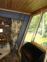
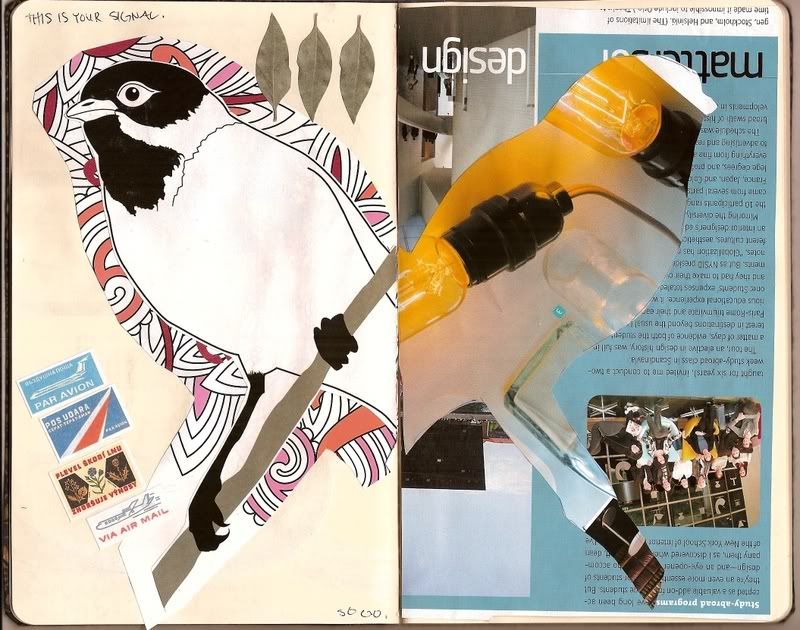
Above left is a photo of the interior of the Loewenstein residence here in Greensboro, and above right is a photo of the interior/exterior of Le Corbusier's VIlla Savoye, located in Poissy, France. I think one can clearly see the relationship between the two from the start, but further analysis about the design language is needed to truly understand what's going on here. The other night I was looking at all this information that I had gathered thus far... citations, photos, my writings... and I struggled with how best to represent it all. Writing by itself is too dry, but what's the relevance of a graphic or a website if it doesn't have a specific aim? I was thinking it needed to be tied to the history/theory class in some way when it hit me... why not use the honors section project as a model for the design analysis? It could easily be expanded upon, in a greater manner than I would for unit summaries, and then designed for a website. I would use my "lingua franca" phrase, as it incorporates the language part of it, and look at the subject[s] [I'm thinking this falls under explorations as it is focused on Modernism], objects, and aspects. The product could be used in the academic environment, thus it's relevant and useful.

Ah, now to organize that information. It's all a matter of plugging it in, then editing and editing and editing. I have my work cut out for me.

20090224

☆ 010 ; bold hype


Some pages from my sketchbook... notes and ideas from class as well as planning for my research portion of my internship, for which I'm focusing on Modernism and Loewenstein, working from larger concepts to smaller concepts. I've been casting my nets widely in the beginning, but pulling in more and more each day. As always, citations are key, and I've caught up in my readings in such books as The Image of the City by Kevin Lynch [this book is probably one of the most important books you can read as an undergraduate], Vernacular Modernism: Heimat, Globalization, and the Built Environment edited by Maiken Umbach and Bernd Huppauf, and Histories of the Immediate Present: Inventing Architectural Modernism by Anthony Vidler. I'm pulling in visual sources, of course, photos from all over [because I have yet to be so fortunate as to see all of these places I'm referencing, like Le Corbusier's Villa Savoye, myself].

Since it's all about language to me I'm also trying to connect to my sociolinguistics class, getting at this overarching idea of standardization of a design language. What I mean by that, and I'll only expand briefly because I don't want to show all my cards, is that in explorations in the late nineteenth and throughout the twentieth centuries, the first wave of Modernist designers had to define a language [perhaps at this point a variation on the previous language(s), as I don't think one can truly escape their histories], and as it spread throughout the world it then became a more accepted and standard way of speaking, design-wise.


Earlier I had wrote a little about my obsession with infographics and maps, and I happened to stumble upon the above image on a search for inspiration and precedence for what my completed research will look like. Linked to its source, an excerpt from Edward Tufte's section in Beautiful Evidence on links, casual arrows, and networks, I not only found the way in which this information was represented interesting [and beautiful] but amusingly pertinent to what I'm working on. It's about art, obviously, but connections can definitely be drawn to architecture in the same time periods. I wonder, then, where I would draw the circle to include Le Corbusier, Loewenstein on this timeline. What's their language?

While I'm on infographics I wanted to share the following images. Never wanting to design without getting a feel of what's come before me, and what are graphic standards that make for generally good design, I searched out other people's work to see how they represented information in non-boring ways. Below are my favorites [click to enlarge and find more information].


-----


On an unrelated note, I can't keep my excitement to myself. My favorite band is coming out with a new album at the end of March and the hype for it is unbelievable! There's a new website coming out soon too [here] and I can't wait for all the graphics. Should be awesome.

...and have one of my favorite songs right now [not from the aforementioned band]:


Wolf Like Me - TV On The Radio

20090218

☆ 009 ; empty cities

Just wanted to share an interesting story--

America's Emptiest Cities

Las Vegas edged Detroit for the title of America's most abandoned city. Atlanta came in third, followed by Greensboro, N.C., and Dayton, Ohio.


I'm surprised to see Greensboro so high, but only because you'd think there were cities more abandoned. But these numbers aren't absolute; the statistics are percentages, naturally, but if you think about it, and the article states this, Las Vegas has 2 million people. Greensboro has around a quarter million, maybe? And just recently I read somewhere about Las Vegas being America's fastest growing city; I guess the two can go hand in hand, the city can be overbuilt and grow fast, the rates must be that different, though. I think it's indicative of the switch in America's economy-- Detroit, a manufacturing center, is rotting, while Las Vegas, a service economy centered city is growing.

Greensboro is much like Detroit in that light, its location strategic for the shipping of such manufactured goods. It's not called the Gate City for no reason! If you just look out the south window of the studio you'll see why. Plus we got the airport. I'm not sure if the deal was finalized or not but I think PTI was supposed to become a hub for FedEx or some such company, which means high-quality goods from places like Europe would come through Greensboro and not other places like New York or Philadelphia. That means jobs. And prestige.

But I digress, a little bit. If this is the case [Las Vegas becoming the quintessential American city] then what are the implications? I think it gives us a false identity because the rest of America is not at all what the surface Las Vegas is. Las Vegas has connotations that it's never going to shed and those connotations don't apply to elsewhere. But the fact that it highlights a tertiary economy is important. This shift means a lot for us getting an education, and lucky for us creatives we're on the right [haha pun intended, read on!] side of what's happening-- a service and information oriented economy requires more creative thinkers, right-brainers. I would recommend reading A Whole New Mind: While Right Brainers Will Rule the Future by Daniel Pink [if you follow this link there are pictures of Obama cupcakes. OBAMA CUPCAKES.] for more insights on this idea.

I wonder what these empty cities, especially Detroit, will look like in 100, 200 years. Manufacturing ghost town? Architecturally, that would be neat. Like an outdoor museum, a snapshot.

20090216

☆ 008 ; graphic explosion

Here's what I'm really digging this week [click for websites]:


It comes to no surprise to myself that these are the sorts of things that break communication expectations, that transcend whatever people can take them for at face value. An artist, a band, a project. I think all three challenge us in ways that make us rethink what we see and how we interact with people and our environment.

BANKSY

Banksy is a British street artist who works mainly with graffiti-based graphics. What's really important about his work is scale, in the sense that there are street-level works that are viewable to everyone, there's no discernment in who can and can't see the works and interpret it for whatever they want to take from it. The environment that we created for ourselves [streets, tunnels, building walls] becomes the museum. I would say there's been a revolution, and you see a lot more street art lately than you used to, especially in big cities.


not a Banksy work, but one of the many images I stumbled upon in Seoul


BIG BANG

Big Bang is a Korean pop band, but my appreciation for them goes far deeper than that! They must have the best graphic design team, I think, because all the products and promotional things they put out are always so well-designed and innovative. They really take advantage of the graphic aspects of the music industry to further cement what their image is, and makes it easier as a consumer to read and understand who they are, and more entertaining as well.


images from Big Bang's latest concert dvd release


POSTCROSSING

Before I got bogged down with work, I used to like participating in the Postcrossing project. It's simple, really, people receive your address and you receive other people's addresses and send them postcards, usually depicting where you're from. I got postcards from France, Finland, Hong Kong... just, all over. In this age when I can just email someone and get a response in a few minutes, there still survives this sense of scale [oh, scale again?], a human scale, of postcards crossing the earth, of time and space. And the fact that these are complete strangers you're writing to? I don't know if I feel more or less isolated, but it's an interesting concept.

-----

While I'm on things I enjoy let me just show you a little something I found on my blog around. I have a thing for maps. Maps of any kinds. Informational maps like this one, or locational maps like this one, or your regular old map. Word maps. Image maps. You get it. So I found this map and about had a fit:


Obama Wikipedia page edits from Jamie Dubs on Vimeo


NEAT.

-----

And on a final, non-serious note, this is what my bed looks like after I've been journalling:


The cat is always included [she is always within a ten foot radius of me when I'm home]. I like making messes. Update on what's going on in my paper journal later.

20090215

☆ 007 ; a counter-argument


I'd like to put forth the idea that the Parthenon is actually not the ideal temple type, yet maybe a super-ideal... I don't know, what do you call it when you break the archetype? It's not a hybrid, not a prototype, not the archetype, BUT it's also the very symbol of ancient Greece, the one building probably everyone in the Western world will imagine if you ask them about Athens. A symbolic un-archetype. It's certainly possible but I think it's strange that in a society that is purported to have chased the ideal form wouldn't create the truest ideal form as their most visible structure.

First of all, the ideal temple type measured six columns across the front. Now if you look at the picture at the top, how many columns are there? Count 'em-- eight! Two extra columns. Not only that but at the porch areas the columns are doubled up, that is to say, there are two rows, but only six on the inside. This sets the temple form up for an unusual opportunity.


Unlike the ideal temple type which has a single frieze that correlates to its order, the Parthenon has two friezes, a Doric outer frieze with triglyphs and metopes, which depict battles between the gods and other mythological creatures, and an Ionic inner frieze, which depicts the Panathenaic Procession, which occurred every four years. The outer and inner layers of columns are all of the Doric order, as well, so not only is it odd to have two friezes, the second frieze doesn't even correspond with the set of rules of its order.


To speculate on why the Parthenon was built this way I'd like to pull back on the idea of its visibility and the fact that the ancient civilization[s] situated on the Grecian peninsula were ones of warring city-states, and there was always a need to best the others. The people of Athens wanted to represent themselves and Athena in such a way that their superiority wouldn't be questioned. I think this harkens back to the idea of the wu-wu. If columns are wu-wus, which, I mean, you can't really argue otherwise [phallic symbol is really phallic!], then having more wu-wus than your competitor? Yes! It's not only size, kids, but quantity.

Also, the Parthenon did, at some point, serve as a treasury, so it was all about making a statement about wealth. If they could afford to have the eight columns and two friezes and whatever else they wanted then why not? In this way Athens said to the other city-states that not only were they better, but more well-off, too.


A final [slightly unrelated] note about color: don't make the mistake in thinking that these structures and sculptures were bone-white stone, they were actually painted. I bet it was real striking, too, and it's too bad the paint didn't survive. I think what's interesting about this, though, is that in following civilizations, particularly in the United States with governmental or financial buildings such as the White House, during reprisals of the Classical style [Neoclassicism, for example], these buildings totally lack in color. I can't help but wonder if the original colors of the Parthenon survived if our own buildings would look different. I think yes. It would be neat to see what color choices they would make... the obvious is red and blue, but that seems a bit tacky, no? It works for the Parthenon because, I'm assuming, there's no prior cultural attachments to the colors, at least not as strongly as we attach ourselves to red, white, and blue. Imagine the Capitol Building in those three colors, it would look like the Fourth of July puked all over it. It's just too obvious for my tastes.

20090209

☆ 006 ; note-taker


;;;


As transcribed from my notes:

I don't think there's anything I love more than this trend towards mixing space design and graphic design-- whether it's using graphic elements as material choices or the end product of the design is a space with graphic-quality views. I feel these spaces are more successful because they call upon a greater vocabulary within design language to engage the user and their senses.

SPACE GRAPHICS

In using graphic elements to enhance or create space, you call upon two important parts of the brain-- the brain that is analytical and sees the space in a deductive, more concrete sense [visual elements of separation, for example-- you stand here while this rests here], and the brain that sees/feels a sense of aesthetic, that not only does the space direct you to behave a certain way but asks you to have an emotional responses. In invoking physical and emotional responses I think a space is better able to serve its purpose or surpass/transcend the purpose-- there is no need for why, or at least you are led to believe so.


example
example
example


I don't think it's surprising that all of these spaces were featured in the same issue of Interior Design magazine. If anyone's going to pick up on a trend, it's them.

;;;


-----

recommendations:


[a] movie SLUMDOG MILLIONAIRE I saw this movie and it was hands down pretty much the most epically awesome movie I have ever seen. It takes a lot to make me cry during a movie and I would've at the end had the theater not been packed! It's a really beautiful story, well-told, not to mention the main actor, graphics, photography, and soundtrack are all great.

[b] book REAL WORLD BY NATSUO KIRINO A translation from the Japanese, this novel is really jarring and unsettling. I think Kirino has this really weird and twisted grip on reality. The plot is such a heart-wrencher, you really don't know what she's going to do, it's like she foreshadows a certain event then switches it on you and... I almost wanted to throw the book at the wall.

[c] music EPIK HIGH: LOVESCREAM Their latest minialbum following the release of the full-length album Pieces, Part One, Epik High, a three-man hip hop force, brings a different sound, something more jazzy, better beats, and some English lyrics [!]. This album has such an undefinable mood, you'd really just have to listen to it. For a preview, their video for their single from this album:

20090204

☆ 005 ; at the other end of the timeline

While a person dies every day during the eight or more hours in which he or she functions as a commodity, individuals come to life afterward in their spiritual creations. But this remedy bears the germs of the same sickness: that of a solitary being seeking harmony with the world.

Che Guevara


What I am zooming in on here, ladies and gentlemen, that little black square in the middle of nowhere, is the Luxor casino and hotel in Las Vegas. I recently took a trip there back in mid-January and was completely perplexed; Las Vegas sells place like no other. They have a term for this, much to my excitement!-- cultural commodification, which really means if they can pack it and sell it they will. I couldn't buy into it, my delight was on a much more intellectual level, but I can see why this dusty city in the middle of the desert [as soon as you leave the city limits there is literally nothing in all directions] appeals to people worldwide: you get your Paris, Brazil, Egypt, New York [and everywhere in between] vacations all rolled into one! And there's lots of free alcohol!


Cultural commodification is definitely a product of postmodernism. I struggle with postmodernism a lot, whether or not it's valid, but then again, I would think economic value outranks cultural significance. Or are tied together, as it is in Las Vegas. That's why the Luxor is the perfect example of this tongue-in-cheek design phenomenon-- the parallels are too obvious, but so overstated as to come off playfully. Both are located in desert environments. The top of the pyramid has great design significance [in Egypt they could be capped with gold, in Las Vegas a column of light is emitted from it at night]. Great treasures were stored in the pyramids of Egypt, great treasures can be made in the pyramid of Las Vegas. Plus I'm amused that the exhibit I saw in that particular casino was this one. How appropriate.

This only scratches the surface of the greater question of cultural commodification and postmodernism. Is it a valid way to design? I mean, drawing upon the past is certainly necessary, you need some context, but is this too extreme? Can it be appreciated in the same way Neoclassical buildings can be?

What is clear now is that the West's fascination with the primitive has to do with its own crises in identity, with its own need to clearly demarcate subject and object even while flirting with other ways of experiencing the universe.

Mariana Torgovnick


What would buildings like these suggest is our identity? I think it's like holding up a giant mirror but not being able to recognize the reflection. And that maybe, secretly, all buildings commodify something else, but they don't want to admit it. It's all in the design language-- the design language of Las Vegas is mutually intelligible with the places that it commodifies, but they certainly don't have the same cultural significance. I think by designing places such as the Luxor claims a history as our own, though, perhaps as a reaction to the banalities of mechanical thought and design? Anyone can stay in a hotel, but why stay there when you can stay in a pyramid!

These are our modern hieroglyphs.


I better stop writing, I don't want to sound like a Marxist!

20090203

☆ 004 ; the writing on the wall...?


Make your own reality!


-----

& a song [that I can't get over], because I feel like it!


¹ÏÀ½ÀÇNever Come Down(feat. Dynamic Duo) - Heritage

20090201

☆ 003 ; i'm just sayin'...!


ziggurat ; teotihuacan ; kiyomizudera temple ; us capitol ; sacré coeur ; park guell

We see similar forms all the way from 2100 BCE to the twentieth century all over the world... the philosophies, motives, contexts for all of these places are different, but the architecture is the same. Some things just transcend style...