☆ 028 ; explorations: the shifting image
Arriving at my fourth and final unit summary, recapping the explorations unit, I have built a definition of the phrase “the shifting image” throughout, stacking new ideas on top of foundational ones as I worked during the semester. The definition, thus far, is threefold, and consisting of:
one a series of images that overlap and interrelate to create a sense of the whole [the shifting image]
two describes how we receive, interpret, and store information that we come into contact with through our senses [imageability]
three images are reinforced through the relationships of parts to parts and parts to the whole on a multitude of scales [element interrelations]
Lucky for me, I think the fourth part fell in my lap during class recently, when we watched and discussed Charles and Ray Eames’ short film Powers of 10. The message that the Eames were expressing within that film fits perfectly upon the framework of the shifting image, and ties all three definitional parts together in a way that speaks to me, as a designer.
The Eames point out that there are many images that a person, a building, an object occupy, from the smallest scale on a molecular level to the largest scale on the universal level. These things inhabit a series images that humans, as a part of those images, come into contact on a regular basis, and thus shape our perception of the images. Since we can have an influence on how most of these things appear, we can create our own images and positively or negatively influence our own perceptions, and create holistic and meaningful environments. This is an important idea because I think the Modern designers are the first to challenge the perceptual status quo. Their works may or may not integrate all parts of the series of images, but I think they challenge how we receive, interpret, and store information, and understand the importance of elemental interrelations.
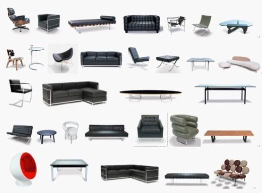
Having prescribed myself to a certain format of writing in previous unit summaries, I would like to try something different, as I have developed a sharper definition of the phrase the shifting image, and would like to look at Modernism and its reactions in a more holistic manner. Taking into account the ideas behind The Powers of Ten in conjunction with Kevin Lynch’s writings in his book The Image of the City, it seems terribly obvious to me that the aspects [people, nature, material, and symbol] are more integrative with the objects than I had implied previously. I had described the aspects as applications of the objects, when, in fact, they are functions; what I mean by that is that the objects do or do not display qualities of the aspects because the designers created them in that way, but that the objects are inherent products of the aspects, and their success is due to careful analysis and planning on the part of the designer. Where objects fail to perform their functions occurs when a designer omits information important to understanding who, when, where, why, and how the aspects interact to create opportunities for the objects, before and after their conception.
Buildings are not idiosyncratic private institution: they give public performances both to the user and the passerby. Thus, the architect’s responsibility must go beyond the client’s program and into the broader public realm. Though the client’s program offers the architect a point of departure, it must be questioned, as the architectural solution lies in the complex and often contradictory interpretation of the needs of the individual, the institution, the place and history. The recognition of history as a principle constituent of the program and an ultimate model of legitimacy is a radical addition to the theories of the Modern movement.Richard Rogers
Where form comes from I don’t know but it has nothing at all to do with the functional or sociological aspects of our architecture.Phillip Johnson
What Rogers states describes a more complete understanding of the shifting image as integral to understanding design, whereas Johnson discards it as a social construct and therefore having no legitimate meaning in the process of conceptualizing, designing, building, and inhabiting. It comes as no surprise to me that some of the objects that follow this more prescriptivist form of design fail when they move from theory to practice and come into direct interaction with the aspects. Within the Modernism movement there are successes and failures; this movement is far too broad and varied to make a generalized statement about the “style”. Being Modern wasn’t a label, as was suggested by Hitchcock and Johnson in their book The International Style, but were responses based on an individual designer’s logic. The criticality of these responses is evaluated by its success in integrating the aspects; in my opinion, a design can only achieve its maximum if it fulfills its functions in a practical manner. I’m not saying that style should be discarded, as part of the function is this social expectation of what a space or thing should look like, but that the implications of a design throughout the myriad of images makes sense [that they perform according to the program’s standards, but also acknowledge the contexts that surround them].
 →
→  →
→ 
?
I think this idea of the foundation for the development of “crap in the suburbs”. Reactionary movements to Modernism become so much about the statement that it loses its identity. These reactions become the norm because they’re accessible to the masses. Modernism set the baseline for creative people to come in and express new ideas, reactions, such as Postmodernism, took advantage of prior theories, perhaps more as design exercises, which led to the lack of identity. By the end of the mid-century, such reactions became acceptable forms of expression, though, and gave rise to the “crap in the suburbs”.
As designers, I think the only way to combat such banality is to acknowledge our roots but to design in an innovative manner that challenges our standards while integrating the existing and future images. I’ll extend the requirements to all objects, that they should have commodity, firmness, and delight in order to be successful and meaningful, but also to lay over it this idea that objects should be reflections of their contexts as to add to the quality of our lives.


