☆ 016 ; websitin'
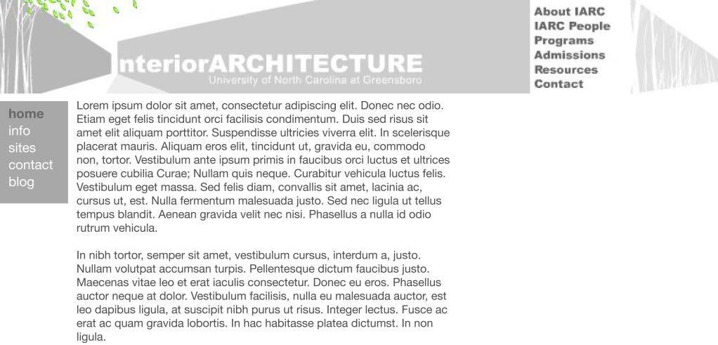
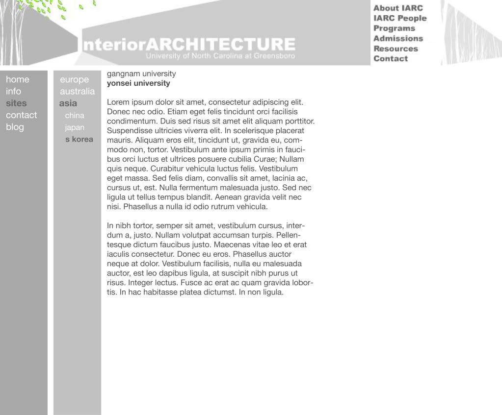
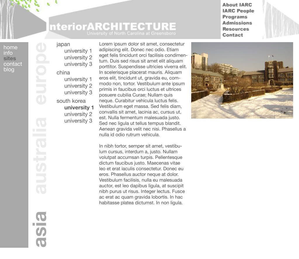
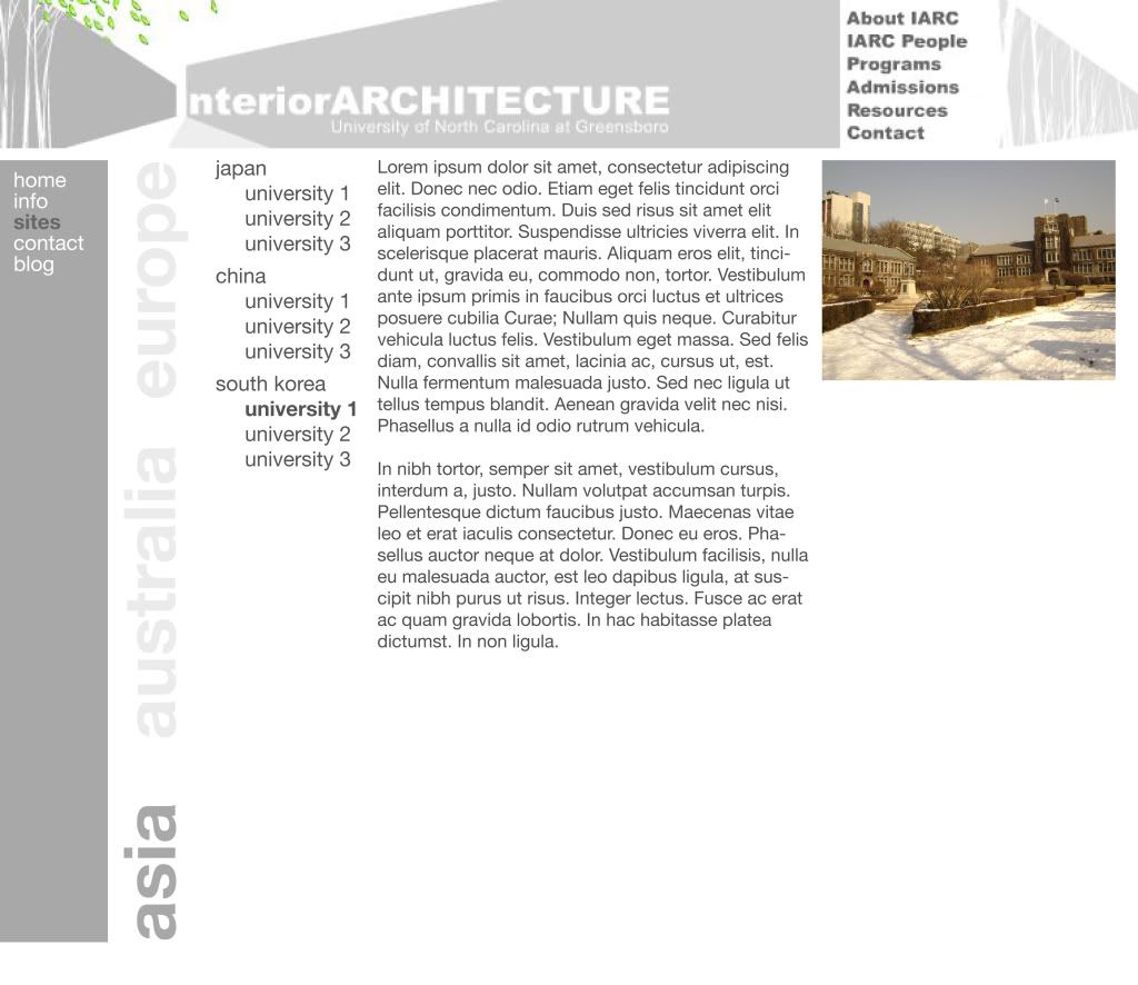
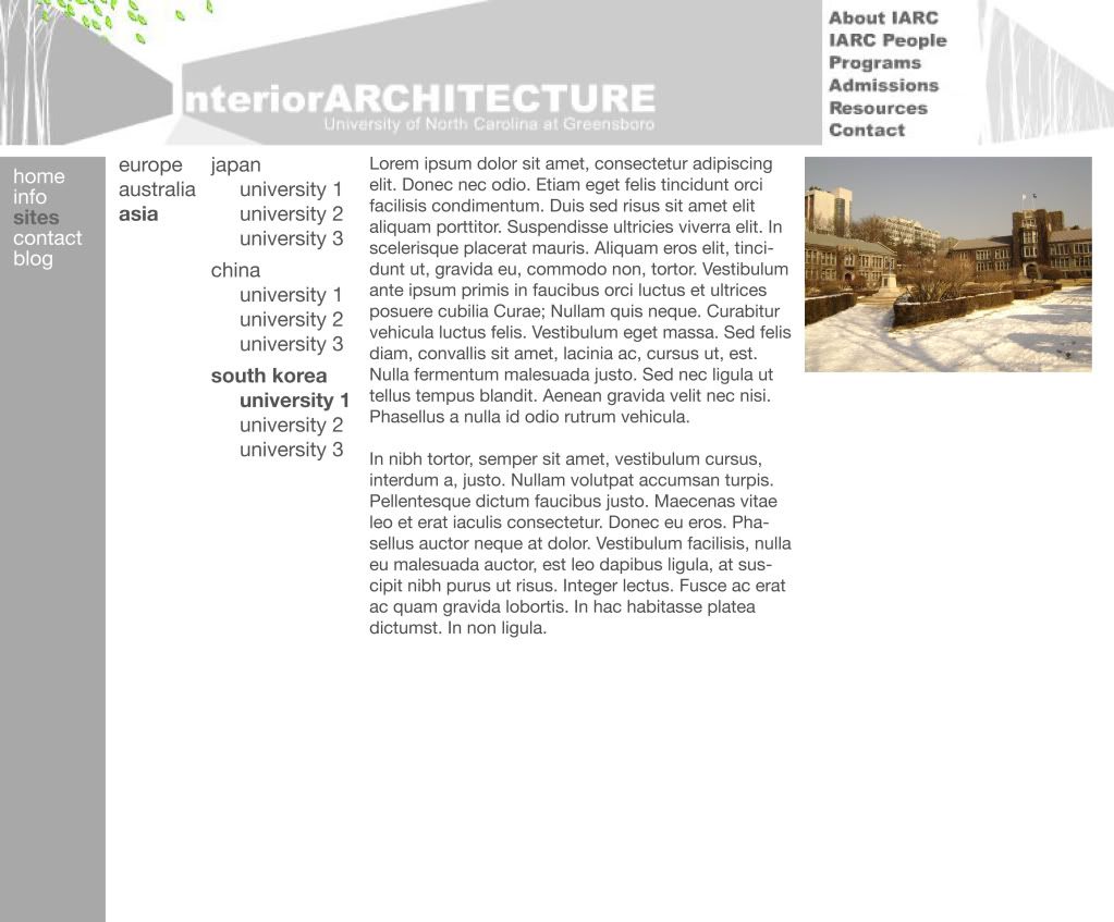
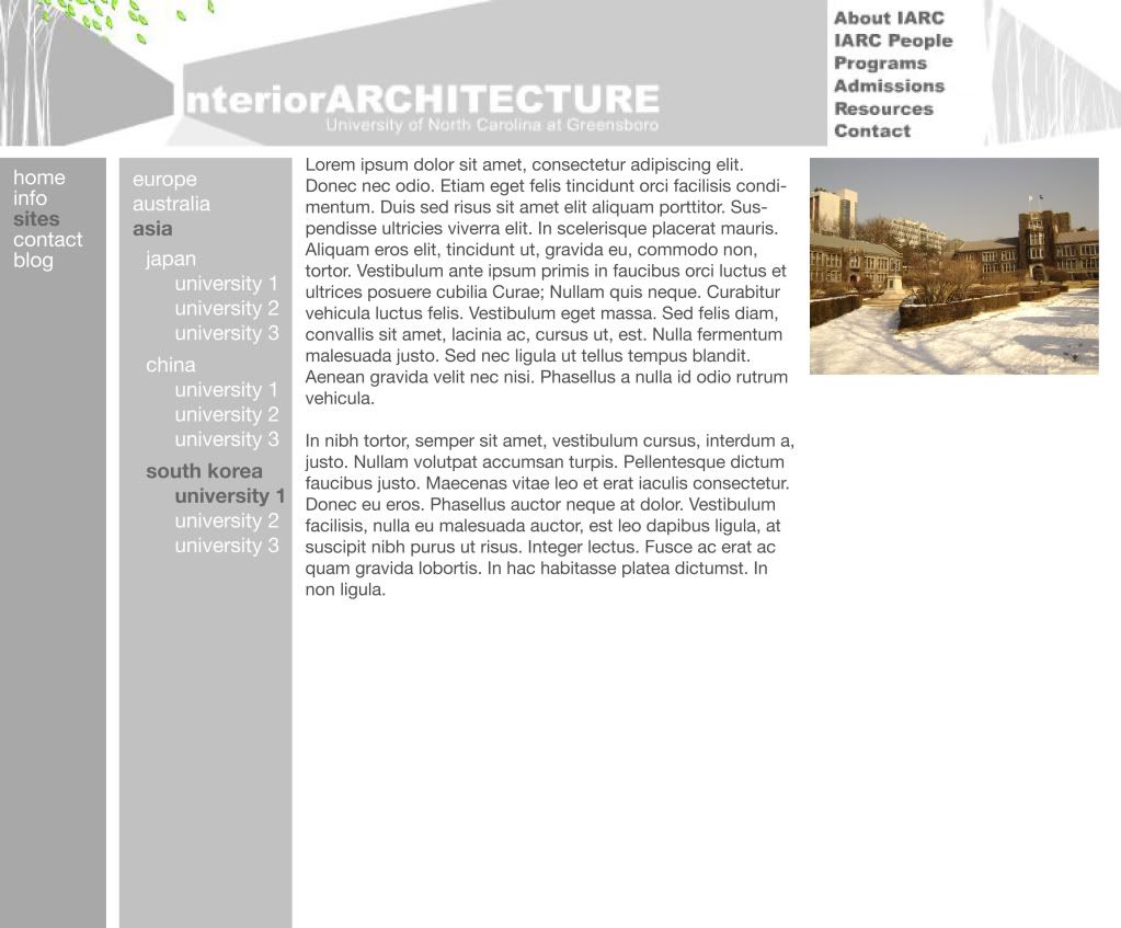
I've been working a lot lately on the new design for the study abroad website. I did some sketching in my notebook about how it can be grouped, then did some mockups in Illustrator, but I'm fairly dissatisfied with what I've come up with so far. I'm sure it's one of those things where I need to stop staring at it and come back tomorrow with fresh eyes and a fresh brain. Below are some images of what I've come up with so far.


Things I'm trying to keep in mind are:
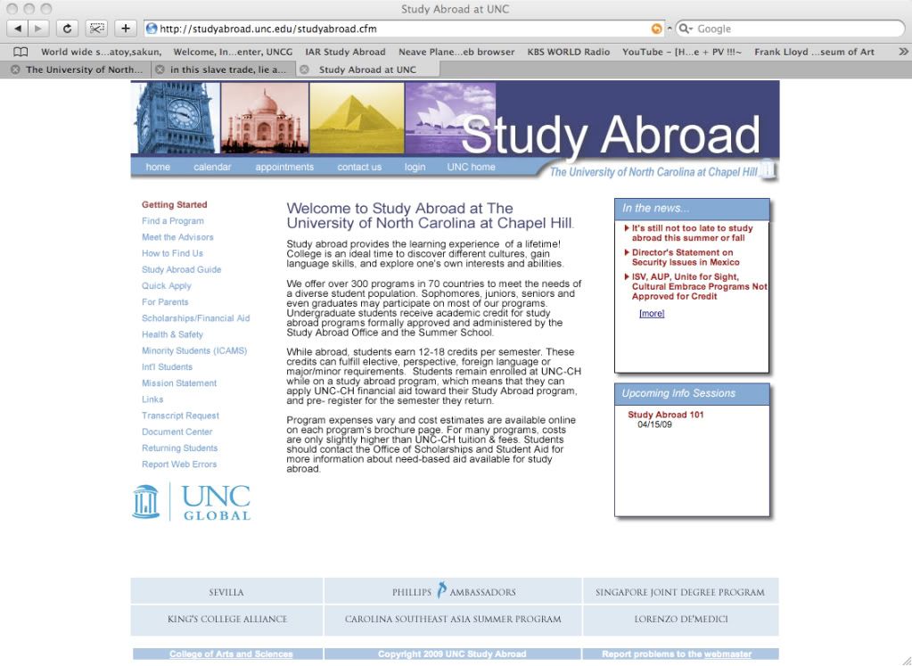
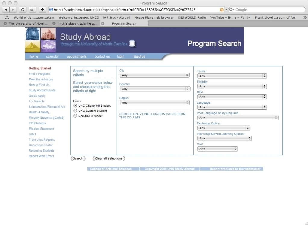
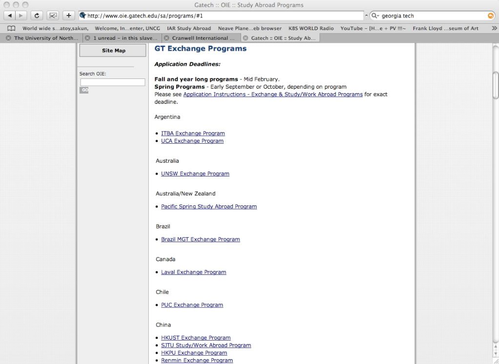
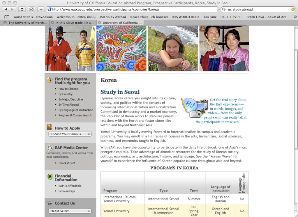
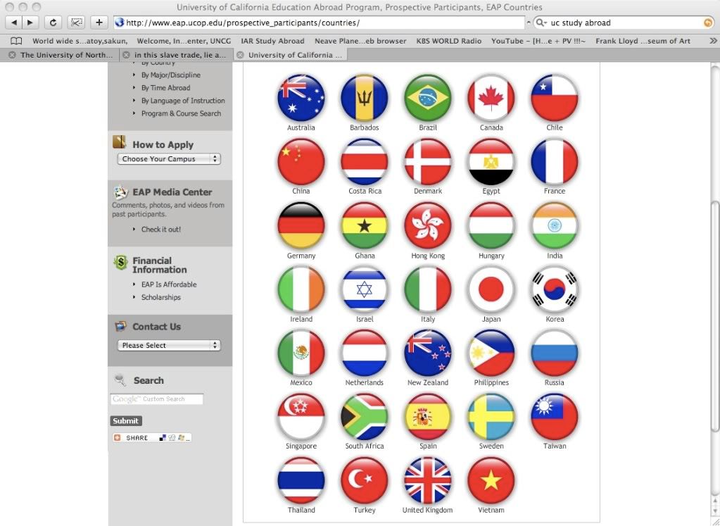
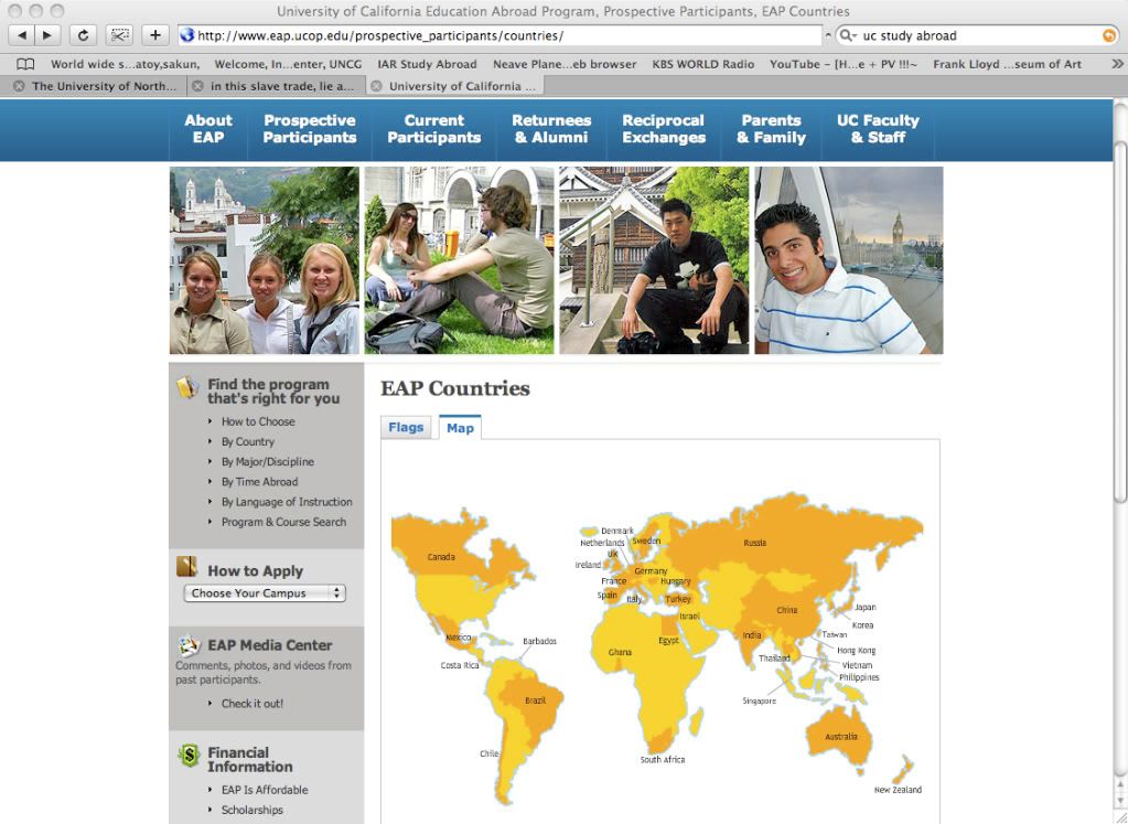
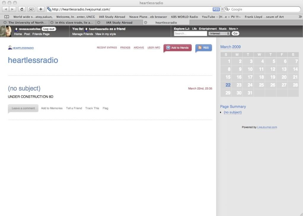
Also, I was thinking I'm designing without precedents, so I surfed around a bit to see how other universities organized their site, keeping in mind that they probably have several people who have a far greater knowledge of web design software than I do working on it. Some sites were a bust (like in the second picture below, of UNC's website, I can't even replicate that), and some showed me things I didn't really want to see (like in the fourth picture, of Georgia Tech's website, I'm sorry but outlines are boring), and some were rather neat (like UC's system, pictures 6-8). I also went to our website and noticed a whole lot of pixel acreage not being used to the right. I could easily use that but I don't want to disrupt the architecture of the site, either. Lots of sites, especially blogs, use a sidebar on the right (see the last picture, from LiveJournal,which is a far better blog site than Blogger, in my opinion). I would then flip the formatting I have in the above pictures so it's photos, text, and sidebar. It seems a bit counterintuitive, though, as we read left to right.


Thinking about blogs brought me to the idea that it can just be a blog and maybe site profiles and the such are entries that are labelled and can be accessed easily. That bothers me to no end, though, because it leaves the text, which would be in the entry area of the blog, quite unorganized, and you would have to rely on the sidebar navigation to get anywhere. Besides, I'm going to be setting up a blog for students to update while they're abroad.
I also thought of putting a little airplane outline in the header image to be cheeky but decided, as Patrick might put it, that it might be lame. D:
Going to end this now before it gets to be tl;dr. Any suggestions or observations from the peanut gallery?
Things I'm trying to keep in mind are:
EASY NAVIGATION No one wants to click five times to get somewhere. And I don't want people to get lost in the site and not know how to navigate back. I've come to the conclusion that I have to find a way to streamline it, instead of having a menu and a submenu and a subsubmenu and so forth.
COLOR SYSTEMS I grabbed the gray from the iarc header, but there's nothing to keep you interested and your eye just kind of floats around, so much gray! Introducing another color or two will create more of a hierarchy. I see there's a little orange line on the iarc website, and some green in the header. I don't want to introduce any colors that seem arbitrary.
FONT SYSTEMS Again, another hierarchy here. Font size, font face, font weight, etc... Working with Helvetica Neue, bold and regular, in between 12 and 14 points right now.
DIVISIONS OF 3 This is just a rule that seems to work out well in graphic design, where you split things up into threes and follow proportional rules. I've tried to apply that with a sidebar, main information section, and a section for pictures. Their placement will be static throughout the site.
Also, I was thinking I'm designing without precedents, so I surfed around a bit to see how other universities organized their site, keeping in mind that they probably have several people who have a far greater knowledge of web design software than I do working on it. Some sites were a bust (like in the second picture below, of UNC's website, I can't even replicate that), and some showed me things I didn't really want to see (like in the fourth picture, of Georgia Tech's website, I'm sorry but outlines are boring), and some were rather neat (like UC's system, pictures 6-8). I also went to our website and noticed a whole lot of pixel acreage not being used to the right. I could easily use that but I don't want to disrupt the architecture of the site, either. Lots of sites, especially blogs, use a sidebar on the right (see the last picture, from LiveJournal,
Thinking about blogs brought me to the idea that it can just be a blog and maybe site profiles and the such are entries that are labelled and can be accessed easily. That bothers me to no end, though, because it leaves the text, which would be in the entry area of the blog, quite unorganized, and you would have to rely on the sidebar navigation to get anywhere. Besides, I'm going to be setting up a blog for students to update while they're abroad.
I also thought of putting a little airplane outline in the header image to be cheeky but decided, as Patrick might put it, that it might be lame. D:
Going to end this now before it gets to be tl;dr. Any suggestions or observations from the peanut gallery?
posted by leah at
21:06
![]()


0 Comments:
Post a Comment
Subscribe to Post Comments [Atom]
<< Home